
The Designer: Jan Jones
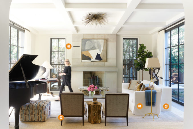
The Project: An existing home purchased by a family with three young children. Designer Jan Jones was tasked with making the home “glamorous but not girly, with color but not a lot of pastels.” The family requested that the piano be incorporated into the space.
- Set the Tone
Jones prefers to start with a statement piece and make subsequent selections based on it. “I really like designing a room around a fabulous rug or painting,” she says. In this living room, the painting over the fireplace set the tone. - Color Theories
The colors collaborate rather than coordinate. “Complement the palette that your central piece sets so the room is cohesive without being matchy-matchy,” she says. - The Right Mix
“A mix of textures and styles makes a house look less ‘designed’ and more as if it has been thoughtfully curated. I love antiques and traditional forms mixed with modern shapes and clean lines. That just really does give a room style and your design the timelessness you’re always looking for,” Jones says. - Worry-free Rooms
Jones treated rugs and upholstered pieces to make even this formal room kid friendly. “Good design means making all spaces as worry-free as possible,” Jones says. “With all the great new performance fabrics, it is easy to accomplish. Several showrooms offer the option to have fiber protection added to their fabrics for a small fee.”
The Designers: Joslyn Taylor and Samantha Sano, Swoon the Studio
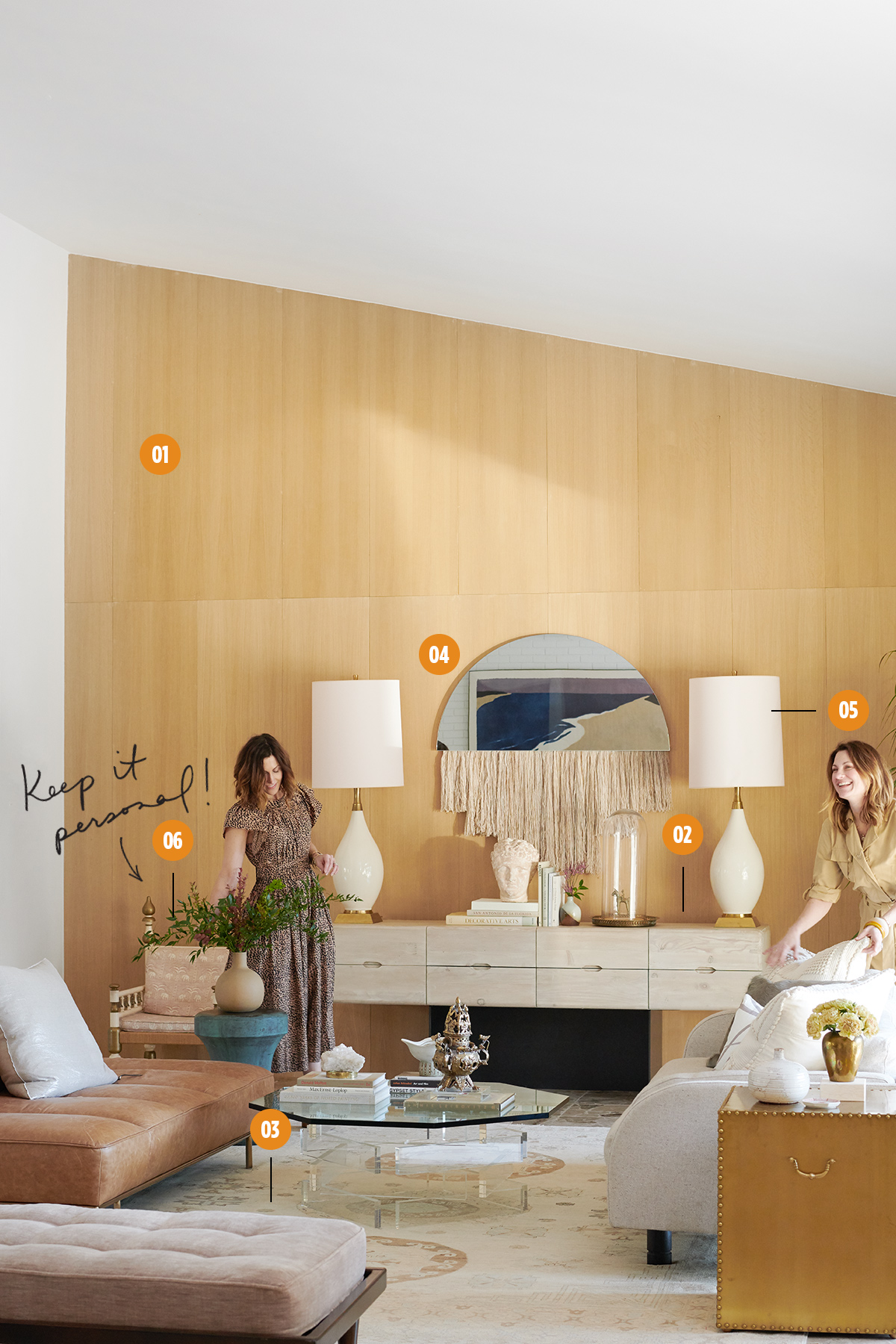
The Project: A young family with three school-age children looking to create a comfortable and kid-friendly abode. Swoon was called in to style this home, then were recruited again to do more extensive work as the homeowners added on a second story. It gave the designers a chance to look at things holistically and have some fun in this soaring-ceilinged, sunken living room.
- Natural Impact
“We talked about wallpaper or grass cloth for this wall, but we decided on this clean white oak to bring in a natural element,” Taylor says. “All of the built-ins throughout the house are in this same wood, so it enabled this room to be connected to the rest of the house.” - High & Low
Despite the room’s height, Taylor and Sano counterintuitively kept the scale of the furnishings low. “If you’re trying to fill the space just for the sake of filling it, it’s going to feel like that,” Sano says. “In a case like this, lower furniture allows the ceiling to be dramatic and keeps it feeling open and airy.” - Color Cues
“We love color, but color doesn’t always mean bright and poppy. There’s so much subtlety to color,” Taylor says. The designers took hue cues from the original terrazzo floor and a painting the homeowner owned (seen reflected in the mirror), then “muddied” the tones into earthy taupes, pinks, and lilacs. “Because the palette was a little bit subtler, we let different textures become the exciting story—the nubby fabric on the sofa mixed with leather, velvet, and brass.” - Meet in the Middle
The homeowners’ styles are somewhat varied—his is more polished, hers more organic—so the Future Perfect fiber-art mirror felt like something they would’ve chosen on their own. Says Taylor: “A truly successful project should never feel like it’s been done by Swoon; it should feel like the best version of you. We don’t want your house to feel overly ‘decorated.’ ” - Perfect Pair
The pair of matching lamps make the design feel intentional. “We wanted this room to feel like a collected assemblage of things, so it was great to have that one moment of symmetry,” Taylor says. “They create a punctuation mark on either side of the console.” - All in the Family
The client owned some great pieces, including this Indian chair, which belonged to her grandparents. The designers used them to inform their work. “If you’re really paying attention to your client, they’re going to tell you a story through what they’ve already purchased,” Taylor notes.
The Designers: W. Tyson Burks and Christopher Ridolfi, William-Christopher Design
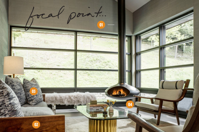
The Project: A guest house for longtime clients who wanted to create a fun place for their college-age children when they come home to visit. The modern structure—which includes a nightclub (!)—looks out onto lush, private land, and the goal was to maximize the views.
- Functional Focus
The custom floating fireplace provides warmth in winter months while maintaining views through the floor-to-ceiling windows. “It takes up a fraction of the space that a traditional one would and complements the modern architecture at the same time,” Burks says. “The tight furniture arrangement allows everyone in the room to enjoy the heat of a crackling fire.” - Great Outdoors
The designers chose furnishings framed in wood to warm up the modern space and bring the outside in. “The architecture itself is pretty stark,” says Ridolfi. “The furniture has an organic quality to it, which helps soften the house a bit.” - Balancing Act
The wallpaper and fabrics were kept neutral so as not to compete with the surrounding landscape. But, notes Burks, “We didn’t want it to be completely sober and void of any kind of fun.” The nightclub down the hall features a three-story-tall fireplace that is clad in brass, so they chose a vintage coffee table with a brass base, Burks says, “to allude to things to come.” - Bare Essentials
Concrete floors complement the modern structure and are easy to care for.
The Designer: Gonzalo Bueno, Ten Plus Three
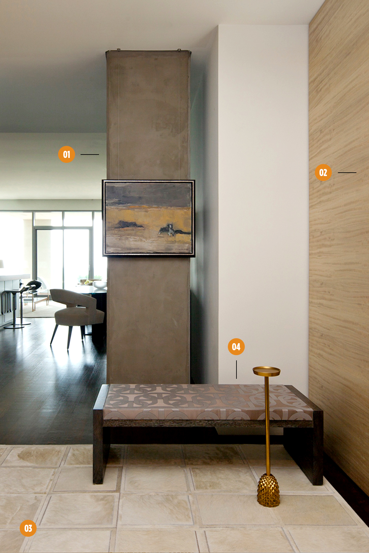
The Project: A One Arts Plaza condo purchased by a couple relocating to Texas, who hired Ten Plus Three after seeing a few other units the firm had designed within the building. The designers were given free rein to refresh the space with new decor all around.
- Eyesore No More
We love turning a support column into the backdrop for a work of art. “We decided to hang the art piece from the ceiling to create the illusion that it is floating,” says Bueno. “We placed it in front of the column because it finishes the elevation, and you can still see the view when you walk in.” The painting is of particular significance to the homeowner, so having it be the first thing he sees upon coming home each day makes for a welcome greeting. - Hide and Seek
An exotic Brazilian bleached wood was applied to the foyer walls to create a warm first impression. A hidden door leads to an office. - At Your Feet
The Kyle Bunting hide rug is both pretty and practical. “It can endure high traffic but is thin enough to accommodate surrounding rooms and still bring elegance to the space,” Bueno says. - Take a Seat
A Bright Group bench covered in Hermès fabric and a Jonathan Browning cocktail table create a comfortable place for guest arrivals and departures. “There are no limits to making a space feel finished,” notes Bueno.
The Designer: Carrie Hatfield, Carrie Hatfield Interior Design
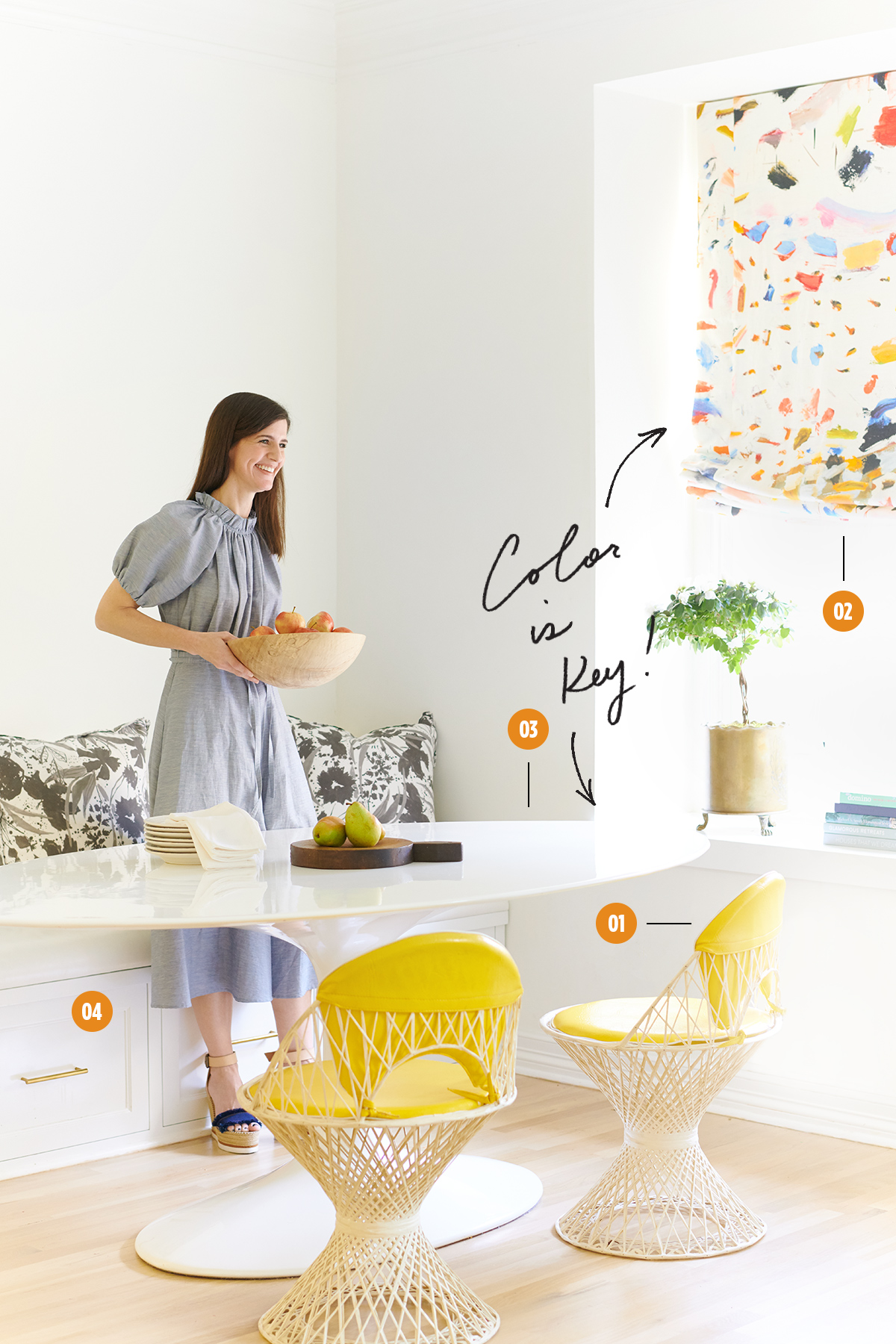
The Project: A late ’80s home that was purchased and gutted by a young family with three school-age children. The kitchen and breakfast nook are used frequently for quick, casual dining as well as countless crafts and projects.
- Color Condition
The kitchen that abuts this breakfast nook is white and black, so Hatfield wanted to bring color into this corner, which she describes as “kid central.” She brought in a pair of vintage fiberglass outdoor Woodard chairs, sourced at Again and Again, covered in the original yellow vinyl, making them durable and easy to clean. - Throw Some Shade
The shades add a touch of liveliness. Hatfield used fabric from Pierre Frey called “Arty.” - Merry-Go-Round
The oval-shaped pedestal table is kid-friendly (“There are no corners to bump heads on,” Hatfield notes) and makes getting in and out of the bench a breeze. When neighborhood friends come over, they can pull up extra chairs—harder to do on a square table—or squeeze into the banquette. - Storage Wars
The bench houses drawers for storage. The cushion is covered in a wipeable white vinyl by Pindler and Pindler.
The Designer: Cynthia Collins, Collins Interiors
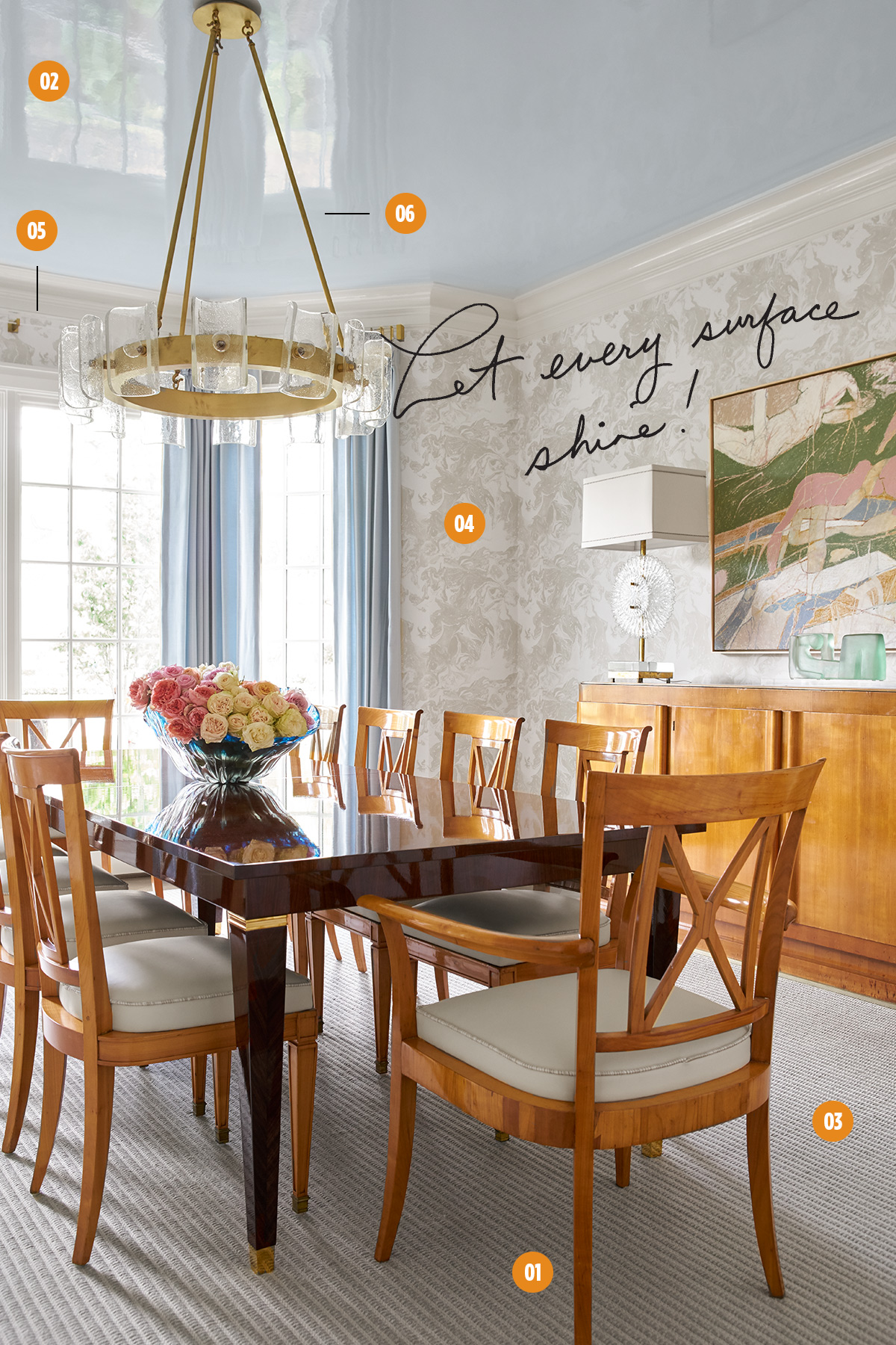
The Project: A young family with two school-age children. The homeowner is actively involved in social organizations and likes to host, so she needed a dining room that could accommodate lots of guests. She also loves color. The home was renovated down to the studs, and Collins Interiors was brought in to transform what would be the homeowners’ first sophisticated dining and entertaining room.
- Blend of an Era
Collins adeptly blends old and new, marrying a set of classic Biedermeier chairs found at John Gregory with a new custom table crafted from lacquered rosewood. The sideboard and Murano glass starburst lamps are antiques, while the overhead Zia Priven fixture is new. “With fresh Christian Lacroix wallpaper and a lacquered ceiling, it all helps to balance each other,” says Collins, who stresses the importance of incorporating antiques. “It grounds a room when you have some historical reference.” - Look Up
The overall feel of the house is casual, so Collins took the opportunity to dress up the dining space. To that end, the ceiling was lacquered in an icy blue tone to complement the window treatments. “At night it glows,” she says. “It envelops you.” - Go Big
“We think about rug size far in advance to make sure we allow for extra seating at holidays and large occasions—we want to make sure our end chairs aren’t falling off the rug [once the table is expanded],” says Collins. This table has a leaf that allows it to sit up to 12, so the Stark rug was sized large enough to accommodate. - No Wallflower
Collins let the walls be the star, opting for muted drapery fabric and chair cushions so as not to compete. “If you want the walls to be the statement, your chair fabrics soften, or vice versa,” she says. - Top Notch
“We always prefer to take the drapery to the crown mould,” Collins says. “It’s an easy way to add height to a room.” - Create the Mood
“Every dining room needs the opportunity for low light,” says Collins, who always puts dimmers on overhead lighting in dining spaces. “It’s best to have moody light at night. Just turn the lamps on and the chandelier light down low—no need for can light.”
The Designer: Denise McGaha, Denise McGaha Interiors
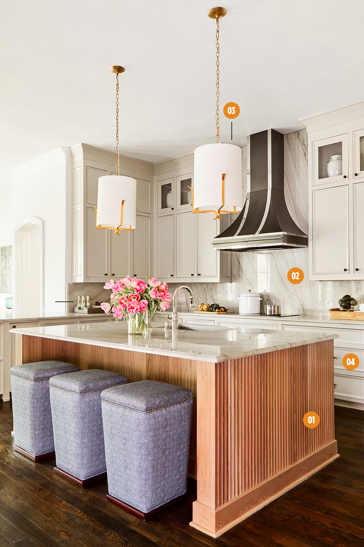
- The Project: A 1990s Southlake home purchased by a design-savvy family of six (plus two dogs) that relocated from Connecticut. The homeowners came across designer Denise McGaha’s design work in a real estate listing, and she was entrusted with not only designing the entire home but touring properties with the client and interviewing contractors on their behalf. The home was gutted, with the entire project taking less than five months, start to finish. The client wanted a pretty kitchen that would be functional and accessible for her young family.
- Wood Works
McGaha collaborated with her cabinetmaker to create fluted panels that give a textural pop to the island and refrigerator/freezer doors (not pictured). She chose white oak with a natural finish to counterbalance the dark floors. “It was really important to me that we didn’t try to kill the graining of the wood by painting or staining it,” McGaha says. She gave the island a step-out furniture base rather than a typical toe kick for a more finished feel. - Make a (Back)splash
The same quartzite used on the countertops (sourced at Aria Stone Gallery) was utilized as a backsplash. Taking it to the ceiling unifies the space, draws the eye up, and creates a backdrop worthy of the custom hood. “Always plan in your budget to carry your backsplash all the way up to the ceiling,” advises McGaha. “And if you have space above your upper cabinets, tile above that. It makes a huge difference.” - Mixed Metals
To keep the kitchen from feeling too new, McGaha intentionally mixed finishes: black and stainless on the hood, nearly black cabinetry hardware, a polished nickel faucet, and brass Arteriors pendants. “I wanted this to feel collected over time,” she says. - Wave of the Future
The homeowner wanted the microwave placed low so even her smallest kids could access it. Her other requirement? “It had to be able to fit the height of a Venti Starbucks cup,” McGaha says. “We went to the appliance showroom with a cup and tested it inside each one.”
The Designer: Joshua Rice, Joshua Rice Design
The Project: A kitchen redo in a 1980s-built, modern-style home. The empty-nester owners appreciate design and asked designer Joshua Rice to create their dream kitchen—one that was functional yet comfortably minimal.
- Open Up
Pocket doors preceded this open, airy kitchen. “They stayed open all the time. It wasn’t a very practical solution,” Rice says. So he removed them and amped up the aesthetics. He combined white laminate Bulthaup cabinetry with a custom wood inset for a visual pop. - Out of Sight
All pulls are fully integrated or touch latch to maintain a seamless look. Rice also utilized undermount touch controls to eliminate the need for unattractive light switches. - Island Life
Durable Caesarstone in Fresh Concrete 4001 makes the island countertops ultra-usable and easy to maintain. Rice commissioned a giant butcher block in matching white oak to hover off the end. “It functions as a cutting board and bar top,” he says. - Keep it Clean
The cabinets house large drawers for keeping unsightly small appliances at bay. They can be set on the inset counter when in use, then quickly tucked away.
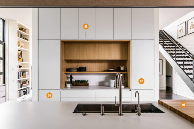
The Designer: Angeline Guido Hall, Angeline Guido Design.
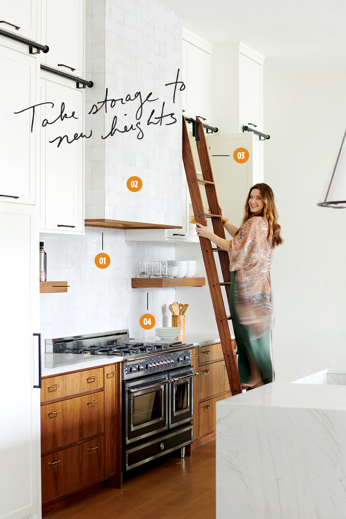
The Project: A spec home in Preston Hollow built by Holly Forsythe of Forsythe + Hall Homes. While the design needed to have mass appeal, designer Angeline Guido Hall took chances to make the interiors feel unique. For the kitchen, she took a traditional color scheme and gave it a twist.
- Accentuate the Positive
To break up the timeless white palette, wood was used on the drawers, on the floating shelves, in the detail at the base of the hood, and on a waterfall butcher block on the island. Walnut was chosen not only for its natural beauty but also for its ease of care. “If it gets scuffed up, you can just lightly sand it, and every six months to a year reoil it, and it will always look beautiful,” Hall says. - Another Dimension
Monochrome can still be multidimensional. Hall used organically shaped, glazed white tiles on the hood and backsplash that create a reflective shine. “You get that play on a little bit of pattern, but it’s really just coming from the natural texture,” she says. - Ladder Up
“People like to take the cabinets all the way up, but then you have to get a ladder out of the garage to actually reach them,” laments Hall. She designed this rolling ladder that allows for stylish and convenient access to high cabinets in the kitchen as well as the butler’s pantry, where it docks when not in use. - Float On
“People are afraid of floating shelves because they feel like they have to look perfect all the time, but it’s really not that way,” says Hall. These provide a perfect perch for everyday plates or easy access to olive oil and spices while cooking. “They don’t have to be accessorized to where you don’t touch them,” Hall insists. “Actually use them!”
The Designer: Jan Jones
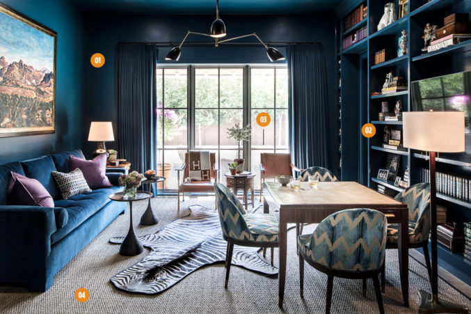
The Project: An existing home purchased by a family with three small children. The homeowner requested one room be a rich color. While the rest of the home is open and light, this more enclosed study provided the perfect opportunity to go in a boldly different direction.
- Blue Out
For maximum impact, Jones used the same rich blue in multiple executions—on the walls, built-ins, draperies, and sofa. - On Display
“The client has an extensive collection of Staffordshire that I just knew we had to feature,” says Jones, and the built-ins in the study provided a perfect place for it. “I wanted to give the collection a fresh attitude”—enter the modern blue shade—“and give the homeowner a fresh appreciation of the collection that she loves.” - Location, Location
Choices were made with practicality and proximity in mind. “Since the room has a door leading to the pool, I did seagrass on the floor since it is virtually indestructible,” Jones says. - Cut a Rug
Make sure rugs are large enough for the room,” Jones advises. “I use a lot of seagrass and sisal because they’re so affordable and look great with rugs layered on top of them. Plus, they can be templated to fit the entire room most of the time.”
The Designer: Denise McGaha, Denise McGaha Interiors
The Project: A complete gut of a 1990s Southlake home purchased by a family of six. This multiuse office was created as a place where the man of the house could work or watch a game, so designer Denise McGaha went for a “masculine and forward” vibe as a break from the traditional feel of the rest of the house.
- Prints Charming
The impressive layering of pattern on the chairs, draperies, and ceiling almost make the busy prints work as a neutral. - Sound Proof
Wall-to-wall wool carpet from Truett Fine Carpets & Rugs was installed for acoustics when the man of the house turns on the game. - All That Glitters
McGaha chose the Currey & Company chandelier for the hints of gold it brought to the space. “It adds a little bit of glamour,” she says.
The Designer: Cynthia Collins, Collins Interiors
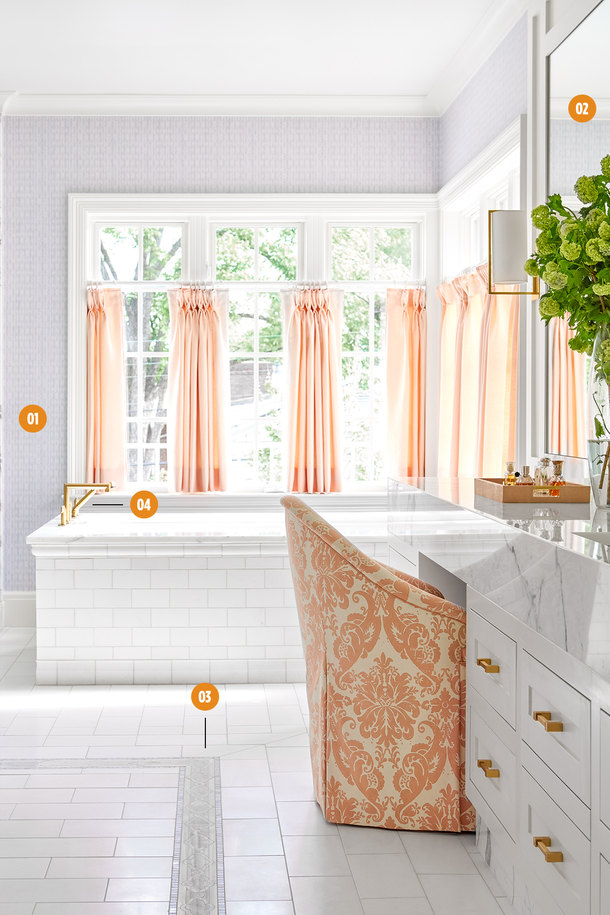
The Project: A complete gut of an existing home owned by a young family with two elementary-age children. The homeowners wanted a bright and clean master bathroom with a bathtub for their kids. Though the square footage is generous, Collins Interiors was tasked with making the room not feel excessively large.
- Get Personal
Good design is tailored to you. “The homeowner has really curly hair, and she has a dome-shaped dryer, like the ones from the beauty salon. We made a special home for it so she can roll it away,” Collins says. - Custom Touches
Luxe details make the space feel anything but cookie-cutter. The mirrors are built into custom paneling that the sconces sit in. A deep mitered edge on the Calacatta gold marble countertop is accentuated by a marble toe kick. The chair was custom made and tested on site for fit. - Floor Mode
The Ann Sacks fretwork border on the floor gives the grounding appearance of an area rug. - Consistency is Key
“Generally for fixed hardware like plumbing, we try to stay in the same family of finish, whether that’s unlacquered brass or polished nickel. But we might mix finishes in lighting when appropriate,” Collins says.
The Designers: Philip Vanderford and Jason Jones, Studio Thomas James
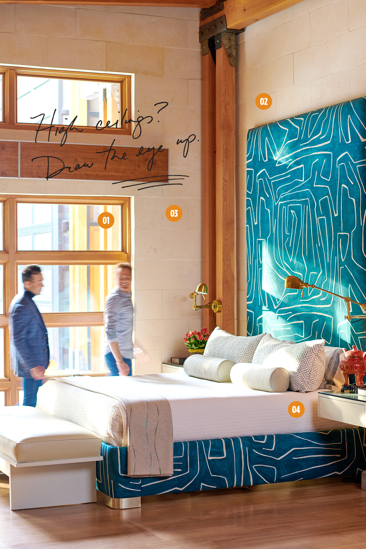
The Project: This was Studio Thomas James’ third house for the homeowners, who have two dogs as well as three grown children and lots of grandchildren, all of whom visit often. The existing property had great bones, along with lots of warm wood and limestone, but was initially finished like a commercial project. Despite the home’s grand scale, the homeowners wanted it to feel intimate and personal.
- Now You See ’Em…
Motorized shades provide privacy while keeping the look of the modern space crisp. - Fit to Print
In lieu of a rug or draperies, the bed does the heavy lifting in terms of soft finishes and graphic impact. Vanderford and Jones custom designed a 10-foot headboard and covered the entire bed frame in a Groundworks fabric by Lee Jofa in the client’s favorite shade. “Anything else looked like a tiny little postage stamp against the 28-foot ceilings,” Jones says. - Embrace Change
The brass articulating lights will naturally patina—a plus in Vanderford’s mind. “I like finishes that are living, be it unlacquered brass or polished nickel, that can do their thing and not be so perfect and slick,” he says. - Make Your Bed
The designers’ formula for a beautiful bed: “Have a washable coverlet on the main body—something that’s not terribly expensive. Add a throw at the end and pillows that are all done in super luxurious textiles that will stand the test of time. You want the practicality of something that’s easy to make on an everyday basis, that won’t wrinkle and you’re not scared to use, but with some luxury thrown in there,” Vanderford says.
The Designer: Meredith Steinhart, Meredith Steinhart Interior Design
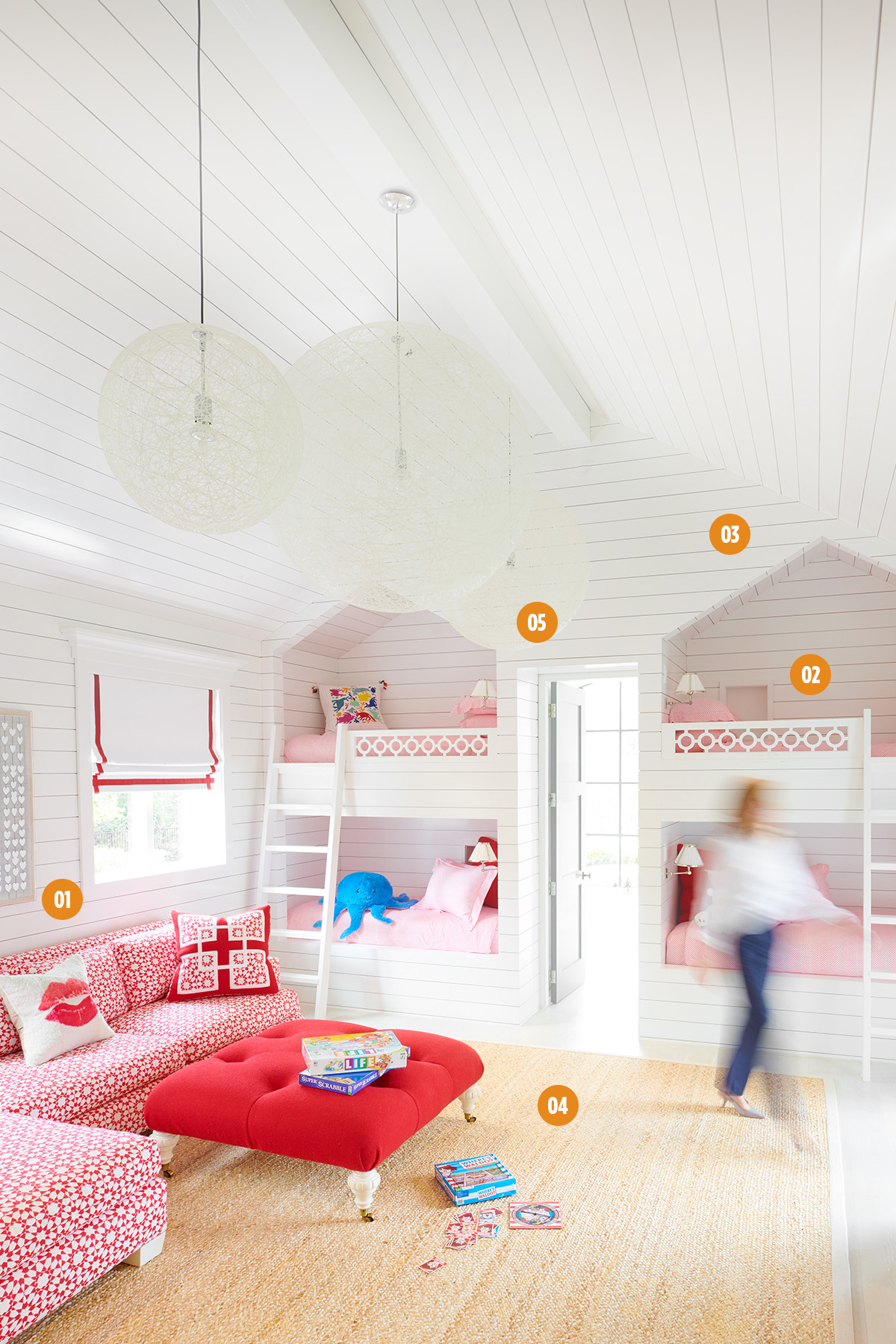
The Project: A new build for a young family with four children—the third project designer Meredith Steinhart has worked on for this family. In addition to a space to play and hang out, the homeowners wanted to accommodate the kids’ friends who come to sleep over. Steinhart worked with the architect to design the built-in bunks and was tasked with finding ways to incorporate items from the clients’ previous home.
- Pattern Play
Printed fabrics are your friends in kids’ spaces: “They’re more forgiving,” Steinhart says. - Sweet Dreams
Four built-in twin bunks provide plenty of sleepover space. Lights in the bunk cavities from Culp Associates provide enough illumination without disturbing bunkmates. - Look to Your Roots
“The client is from the East Coast and likes that New England sort of look, so we did the white paneling on the walls to replicate that style,” Steinhart says. - Keep it Simple
When it comes to playrooms, don’t overdesign. “In a room like this that gets cluttered with kids’ things, it’s nice to keep it simple and really well-edited so it’s not sensory overload. We kept it very monochromatic so it’s not too busy.” - Reinvent the Wheel
Steinhart took existing pieces and made them work for the new space, reupholstering the Quatrine sectional in a durable outdoor fabric, painting the legs, and adding fun pillows. The homeowner had one Moooi light fixture already, so Steinhart purchased two more to fill the cavernous space.
The Designer: Amy Berry, Amy Berry Design
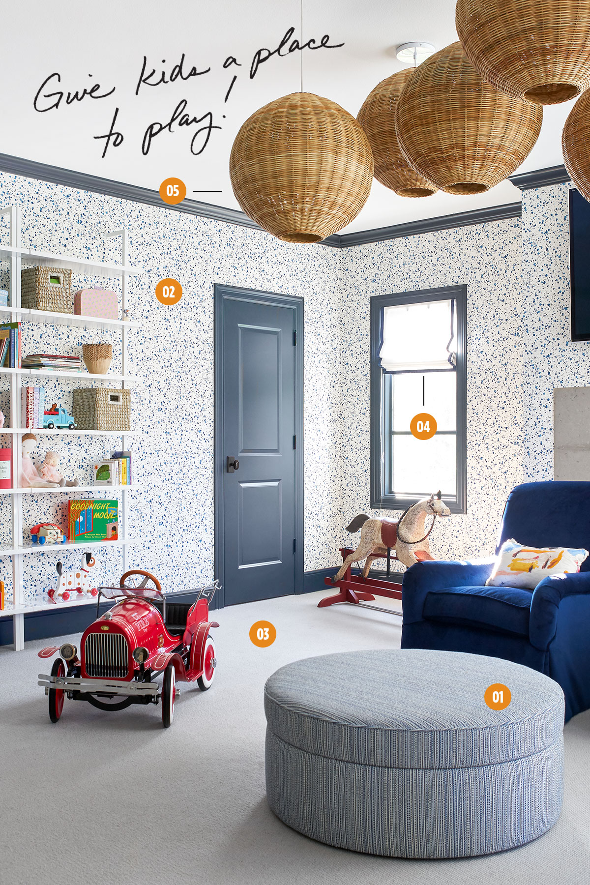
The Project: A renovation for a family with three young children. This space had been used by previous owners as a media room but functioned better as a playroom for this family. The client brought in designer Amy Berry to create a fun, bright, and happy space.
- Play Away
“People can be inclined to put too much furniture in playrooms, but there are so many toys that come with having kids that keeping the playroom pretty open is always the best route,” Berry says. She incorporates hidden storage and attractive display wherever possible, like this storage ottoman and shelves. - Walls That Work
Instead of relying on furniture to make the room feel “done,” Berry covered the walls in Hinson & Company’s Splatter for visual interest. - Have You Any Wool?
Berry prefers natural materials on the floor for easy care and comfort. This wool carpet was fiber sealed for added stain protection. - Safer Shades
Roman shades were a practical choice: “It’s one less thing for kids to be able to grab on, trip over, or stain,” Berry says. - Cluster Effect
Berry turned inexpensive Serena & Lily pendants into a fun focal point by clustering five together.
The Designers: Ashley Avrea Cathey and Mary Beth Wagner, Avrea Wagner Interiors
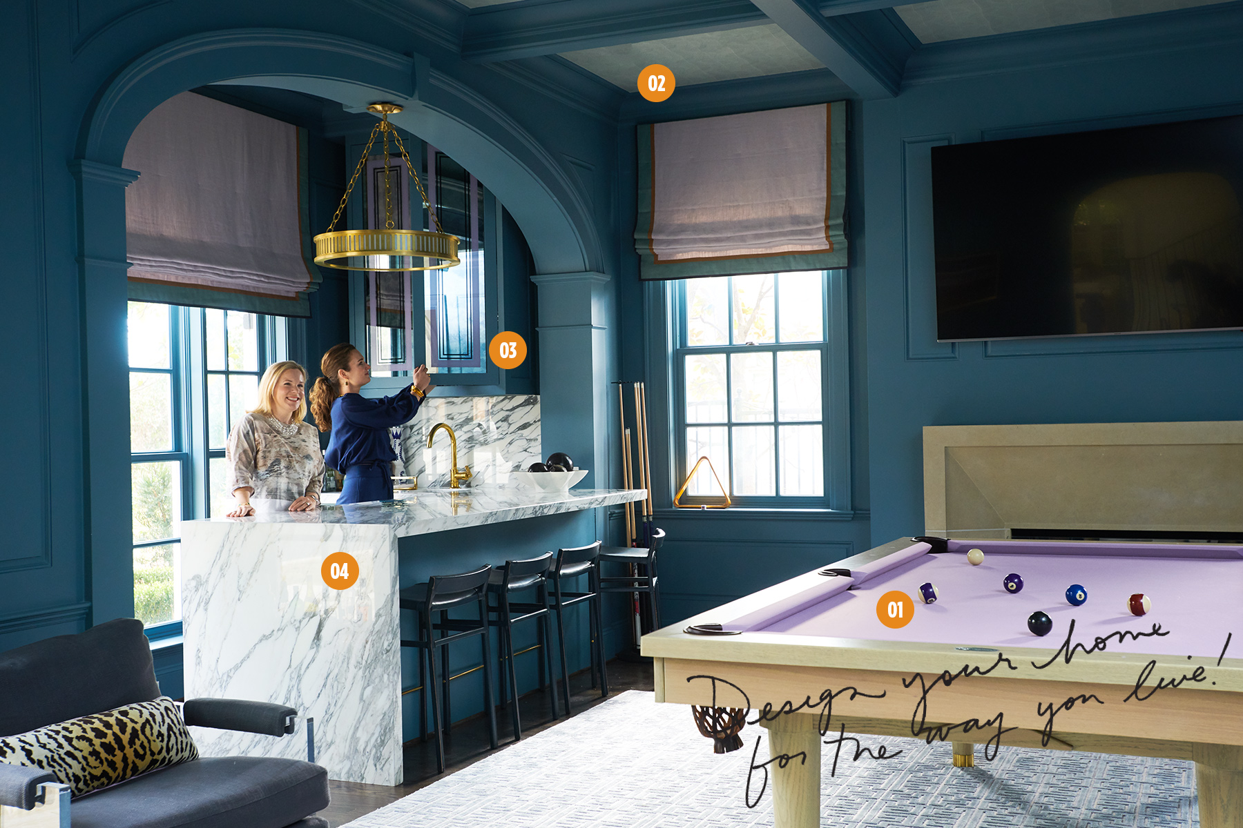
The Project: A whole-house renovation for a family with three elementary-age children. The home’s living room was too large to feel cozy, so the homeowners wanted to create a more inviting hangout spot that offered something for adults and kids alike. They decided to transform the existing study into a cozy billiards room and bar. The only problem? It’s the first room you see when you walk in the front door. Enter Avrea Wagner Interiors.
- Up Your Game
For a billiards table to be front and center, Cathey and Wagner knew it couldn’t be your run-of-the-mill, pool-hall plunker. They commissioned a custom Kirkwood beauty constructed of white oak and lavender felt. - Get Serious
To counterbalance the inherent casualness of a gaming table, the designers went ultra-elevated with their selections. “We wanted it to be a room you would take seriously,” Cathey says. Adds Wagner: “It needed to not look like a frat house.” They used a metallic Holland & Sherry wallpaper in the ceiling recesses, a silk rug from Interior Resources, leather-wrapped Ochre stools from David Sutherland, and a marble waterfall bar. - Carry On
The lavender tones are carried throughout the space, even in painted details on the mirrored cabinet insets. “We love a good theme,” Wagner says. - Anything Goes
Don’t limit a room to just one function, particularly a niche one. With the inclusion of the bar and cozy seating, the room serves as a cocktail lounge and family TV room in addition to a game space. “One of the things I’m most proud of is they actually spend a lot of time in that room,” Wagner says. “It’s their favorite space in the house.”