You should know, if you don’t already, that I keep some pretty big databases. Mostly because all of the various metro and city rankings that are released (that have some legitimate metrics to them) exist in a bubble. There isn’t a way to compare potentially correlated data. So in that vacuum do metrics like Texas Transportation Institute’s Mobility Index, of which, the congestion ranking is used as the be all and end all of transportation policy. And it’s horribly flawed to the point that it’s adherence and adoption of policy based on it is downright pernicious to cities and economies.
So far I had been keeping up with metro metrics for things like highway capacity, population, gdp, commuting patterns, etc. This morning while waiting for security installation at home I began including things like educational attainment (% of college degrees), walkability (using Leinberger’s WalkUP measurement for commercial real estate % in walkable neighborhoods), and TTI’s time lost to ‘congestion’ delays as well as their monetary value for said lost time. This is where things start to get interesting.
The transportation dinosaurs of the 20th century love to substantiate their insatiable thirst for new highway capacity for two primary reasons: congestion relief and economic growth. However, highway capacity does neither. In fact, considering what does yield (or at the very least correlate with) economic growth, new highway capacity very well might actually hinder these things.
(Note: some of these have far fewer data points as metrics occasionally only keep track of largest 10, 15, or 20 metros. This is always a work in progress…as are cities…and policy.)
We’ll start with the only oldie, but goodie: Vehicle Miles Traveled to Highway Capacity. It’s pretty obvious the more and bigger roads you build, the more people drive. The common mistake we make here is thinking that the tail of the real estate market wags the dog, when in fact it is the dog of transportation policy that wags the tail of behavior and development patterns.
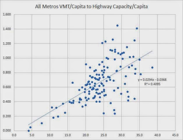
The significance of this chart is that there are metros largely ranging from 20 miles per day per person to 40 miles per day per person. For those 40 miles/day metros, people are driving twice as far, which means you need twice the road capacity to accommodate it. Since people are already driving more because of past road building, we end up chasing our tail trying to keep up with the inertia of our own creation, hence, sprawl.
Think of it this way, if you take a traffic count on 635 in Dallas, you’re probably counting the same car over and over again along several miles of it. However, if you take traffic counts along Champs Elysees or a typical high density urban spine, you are likely seeing many different cars at each check point. 80k, 80k, 80k and very well might be 240k total cars. You get double or triple the capacity simply by shortening trips without adding a single bit of actual physical capacity.
—————–
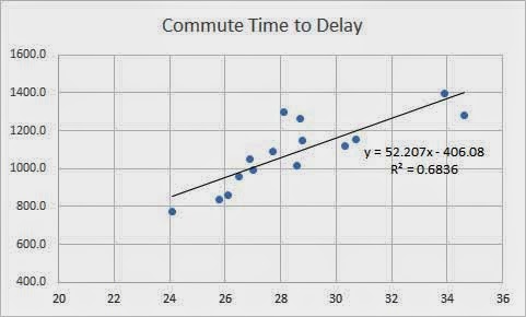
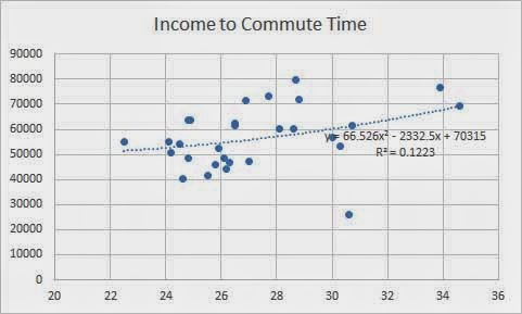
Now, let’s get into some of TTI’s numbers that have the power to shift policy all over the country. Below is their average hours per year lost to congestion in relation to average metro commute times. It isn’t terribly surprising here that places with greater delay tend to have higher commute times. However, it’s also important to note that almost every city falls within the 25-30 minute commute time. This holds true when you expand the chart to include many more metros. The two outliers off to the right, below, are also the highest incomes of the metros charted (NY and DC – where median metro income is 26% and 40% greater than median large metro income). People are willing to tolerate longer commutes for significantly increased cash money.
Since that last chart made sense that means we absolutely have to add more highway capacity, right? Not so fast. Let’s compare highway capacity (lane miles per capita) to delay…
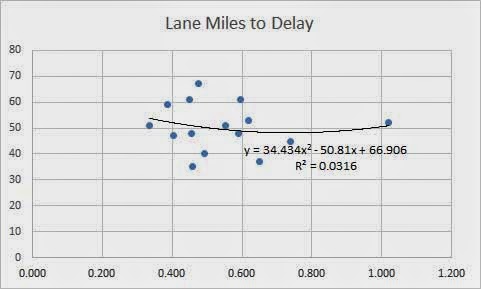
Huh. So, you’re telling me that adding lanes does nothing to eliminate delays?
Earlier I referenced that people will spend a bit more time commuting in order to make more money. However, as the above chart shows, the correlation between commute time and income is fairly weak since all cities tend to exist in this half-hour radius tension. Notice again, most cities fall within that 25-30 zone that all cities throughout the history of time have also. Infrastructure moves the market more than the market moves the infrastructure. So why do we design our infrastructure where origins and destinations currently are if they’re ever shifting based on the infrastructure we build?
/raises hand. “I know! I know! It’s because we let dinosaurs with blinders on determine the outcome of the most important and complex invention in the history of civilization.”
When you think of congestion (when it’s framed simply as a traffic engineering problem), you think of traffic jams. When I think about it from an urban point of view, I think of it as commerce, friction, people getting around creating social and economic exchange (which is precisely why funneling people INTO cars then INTO narrow highway corridors in the densest, most active part of town is terribly misguided and short-sighted). Instead of traffic jams, think of Jane Jacobs’ sidewalk ballet or Ben H. Baillie’s public ice skating rink (same idea).
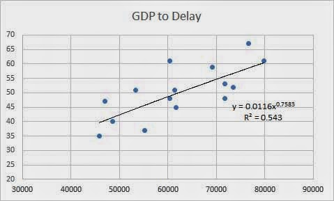
The point of the previous paragraph was to provide context for the preceding chart showing that delays are greater in areas of higher GDP. There is simply more friction, more economic activity happening, thus more delays…particularly if you’re trying to drive through it. I have very little delays walking around (provided there is ample choice and availability of things to walk to).
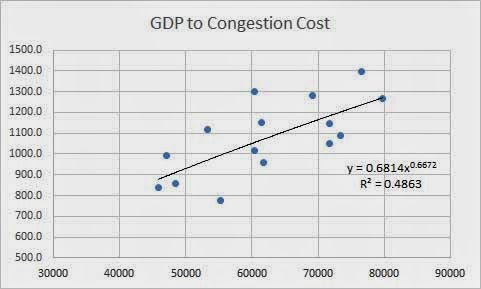
Not a dissimilar graphic above, since TTI uses their delay metric to calculate the cost per person congestion costs residents of each metro. And then we’re all supposed to think, “OMG, we better invest in bigger roads because it’s costing me money,” when they trot out their $120 billion per year lost due to congestion. But there is a catch that isn’t mentioned. It isn’t even what is visible above that more economically vibrant places tend to be more congested. Nope, more critically…
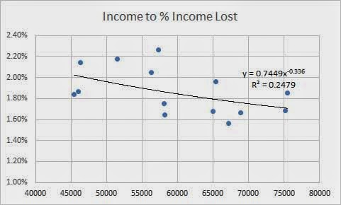
Those places that make more money, despite having ‘greater congestion’, actually spend a lower percentage of their income due to these supposed congestion delays. So, what exactly are we 1) measuring and 2) trying to ameliorate?
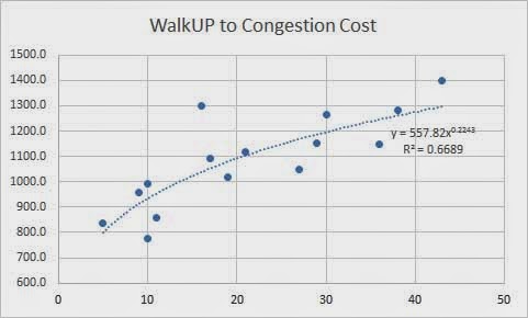
So when we compare walkability via Leinberger’s WalkUP metric of percentage of commercial real estate (the places of social and economic exchange) within walkable neighborhoods to TTI’s congestion cost, we see that, yes, indeed there is congestion (by TTI’s metric) is related to the amount of walkability. Those darn pedestrians (who aren’t in cars and causing vehicular congestion) are getting in the way and keeping me from driving 60 mph, which is how TTI measures congestion (whether cars are going fast). This is one of the fundamental flaws of TTI’s mobility index. They aren’t measuring mobility at all.
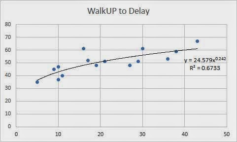
So when we compare to delays, it’s basically the same chart except it is compressed (and I’m unable to delete it from the formatting so here it is).
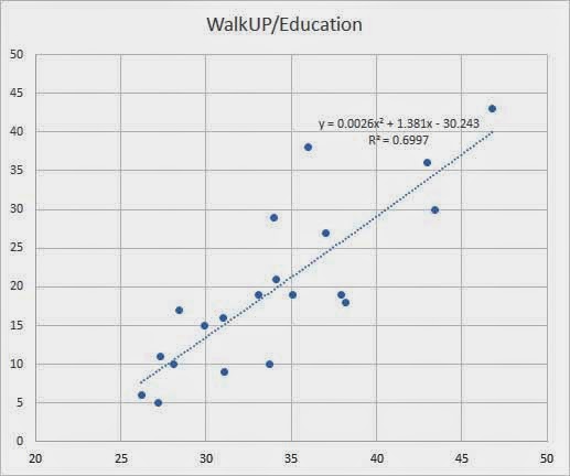
Now sticking with Walkability metric, let’s compare WalkUPs to education rates. Pretty strong correlation. The question is, does a more highly educated populace demand and create more walkable places or do the more walkable places attract more highly educated people? Save your “correlation =/= causation” regurgitation. Cities are complex systems and within complexity is feedback loops. They feed into each other in a positive reinforcing circle. It’s how all cities work. In the opposite direction, when you unwind any thread, say disconnect urban fabric with more highway capacity, you’ll lose people and see disinvestment which then creates a negative feedback loop driving more people away, etc. etc.
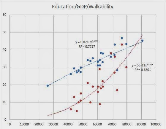
This last one is my favorite because it includes walkability to both education and income. We already know that higher education = higher income, but when do we start talking about higher walkability = higher income (growth!) and a better educated citizenry? What exactly are we measuring? What do we care about as a body politic? They say you measure what you care about and given TTI’s metrics and the amount of attention they get and policy they shift, you’d think all we care about is congestion. However, there are far better places of investment…even ones that see returns on investment, unlike new highway capacity.