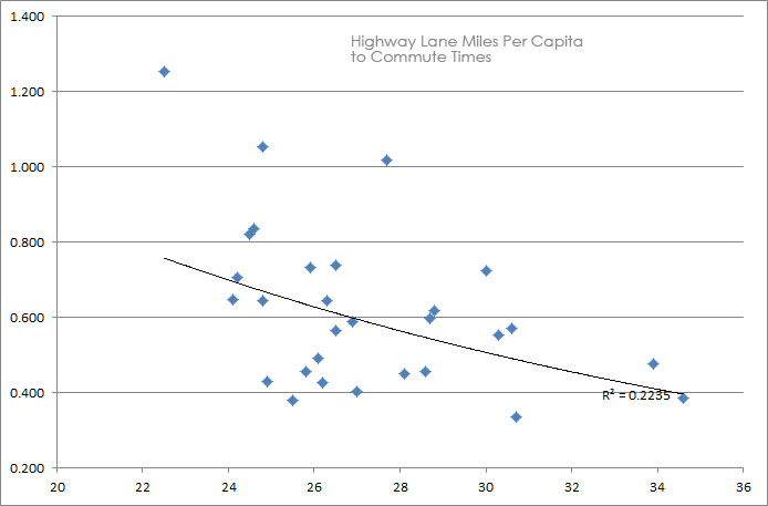
I came across some new data today that I didn’t currently have in my Metropolitan Statistical Area (MSA) infrastructure – density – highways – mode share database mashup. It was average commute time, which I had begun, but didn’t have a full array of data to begin making any charts. Here are those charts.
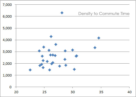
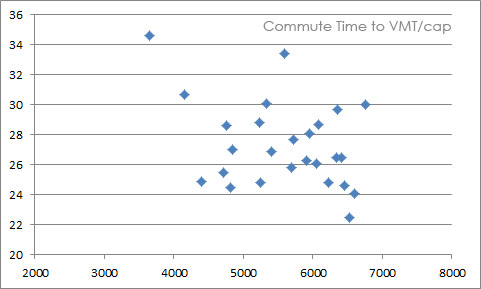
What I wanted to find was whether there was any correlation between a variety of statistics in relation to commute time (that are actually quantifiable and quantified), such as what role do things like density, congestion, highway infrastructure, etc. have on commute times, if any.
My hypothesis was that the correlation would likely be very low, as I expected that commute times had more to do with job to housing balance by location. Knowing cities, you know that jobs and housing tend to co-locate in relation to each other, as (somewhat) evidenced by Prof Peter Newman’s hour-wide city theory stating that no matter the transpo technology of the day, a city is always generally an hour wide from end to end and 30 minutes from end to center. The market simply doesn’t put up with much more than that.
This jives with surveys searching for the ideal commute time, which tend to be about 22 minutes (though that would be below the average commute time in every city). The reality is there is an equilibrium where people like to be a certain amount of time from their work, enough time to prepare for the day mentally on the way to work and enough time to decompress on the way home. Too close or too far, could disrupt this seemingly necessary transitional mood or phase shift.
Onto the charts. Let’s see if I can structure them in an order that makes sense:
Let’s start with the simplest. Distance traveled daily to commute time (which will show up as one axis in every chart):
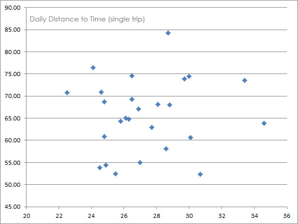

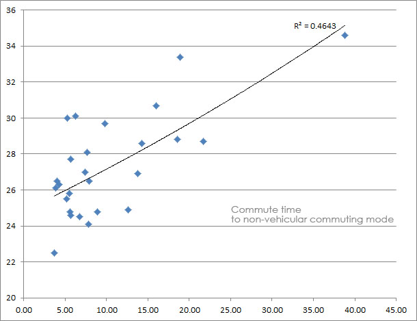
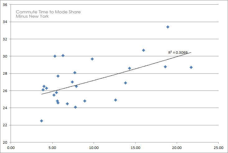
The correlation drops a good bit, R2 dropping from .46 to .30 though that is still stronger than anything else I’ve compared (and many didn’t even make this post). However, there is still a potential lesson here and again, that’s in trade-offs. People are willing to take alternative modes of travel if the time of commute is slightly longer. Why?
My guess is because of the potential benefits of alternative modes of travel, whether that means living in a more dense, vitally active place, the amenity of increased choice availability, increased productivity — the ability to do other things while on a train for example like read or work, or improved health benefits from walking, cycling, or not dying on the many rush hour crashes each day.
On the surface at least, this quick study seems to confirm the theory that no single variable has a signficant effect on commute times more than the natural equalizing force towards that standard 25-30 minute commute. The better, or more interesting question might be, is a shorter average commute preferable or even worth pursuing, if that isn’t the market’s preference (provided it doesn’t create infrastructural and energy inefficiencies in relation to the diseconomy of decentralization).
NEXT!
——————-
While playing around with this data I started thinking about new mash-ups. Here’s one that I call the Commuting Efficiency Index. Or in the case of some cities, the Commuting Inefficiency Index. It adds Average VMTs (as proxy for extra energy expended by driving over increased distance) to Average Minutes of Commute. The thinking here is trade-offs. Some cities could be better at less driving/distance/energy consumption while others could succeed at quick trips, like Kansas City (though this doesn’t measure KC’s big weakness which is infrastructure to tax base deficiency):
3 Most Efficient Commutes:
1. Portland 43.6
2. Sacramento 44.6
3. San Diego 46.7
All West Coast. Interesting.
3 Least Efficient Commutes:
1. Houston 61.0
2. Atlanta 58.2
3. Orlando 57.2
All Sun Belt. Interesting.
Just about every other city is pretty tightly packed between 49-53, but those six stood out quite a bit beyond just being top three on each side of the spectrum.