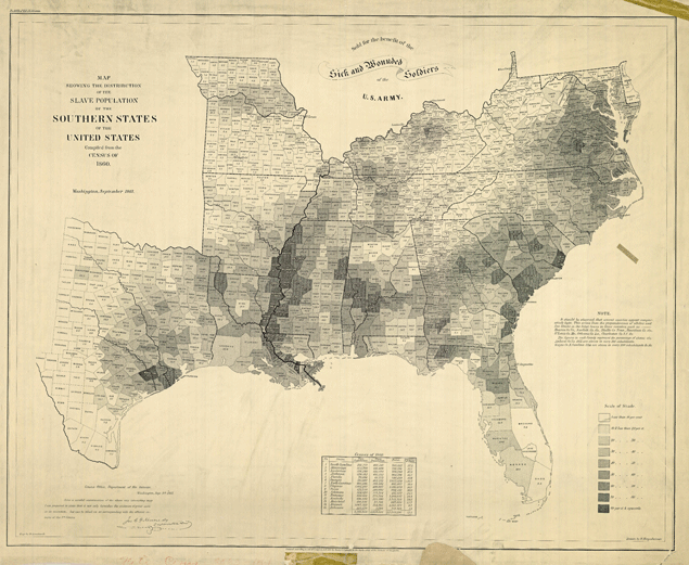
Readers of Andrew Sullivan’s Dish blog pointed out the similarities between the social mobility map that we posted about Monday, a map of African-American population by county, and a map of the last U.S. slave census in 1860 (seen above).
There are striking similarities, especially in the dark patches along the Mississippi River in both maps. So does Dallas’ legacy as part of a slave-holding state help explain its presence on the low end of the social mobility scale today?
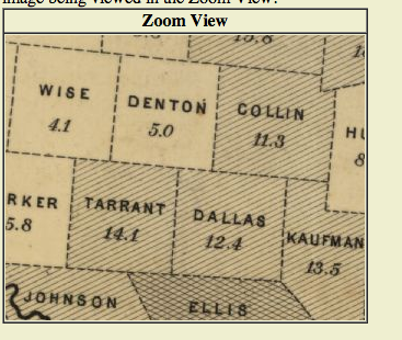
About 30% of Texas’ population were slaves in 1860. You can see from the shading on the slave census map (where darker means a higher percentage of the population in slavery) that North Texas had relatively few compared to the coastal regions of the state. I zoomed in on the slave census map to find out that for Dallas County the percentage was 12.4%, Tarrant was 14.1%, Collin 11.3%, and Denton 5%.
That establishes that there’s not a direct correlation between the number of slaves in 1860 and today’s social mobility in Dallas. For one, Tarrant County had more slaves, yet it’s social mobility number is slightly better than Dallas’. There’s also the matter of Harris County, which does about as well as Fort Worth on social mobility now even though it had substantially more slaves (22% of its population).
So it’s obvious that a lasting effect of slavery alone isn’t responsible. That map of the nation’s African-American population, however, is more troubling.
In the last census, Dallas County’s black population was 22.9%, Tarrant’s 15.6%, and Harris’ 19.5%, which is more in line (though not necessarily perfect) with what the social mobility numbers suggest things would be if there’s a correlation. And Atlanta’s Fulton County, which scored so poorly on social mobility (4%) is 44.6% African-American.
Though the explanation can’t be that simple either.