Redlining has shaped East Dallas. Over at The Advocate, the talented Will Maddox—who we have since poached to cover healthcare, our apologies!—put together this interesting feature that mapped the neighborhoods that the federal government steered mortgage loans to during the New Deal era. He then compared them to current housing prices, racial makeup, and poverty levels. What emerges is perhaps not terribly surprising. The parts of East Dallas that were deemed “best” or “still desirable” are whiter and the homes are more expensive.
Those designations were packed into federal law after the Great Depression as appraisals for the likelihood that mortgage loans would be paid back. In practice, these color-coded 250 American cities, and essentially muscled out areas that had concentrations of black or brown people. In areas deemed “hazardous,” lenders wouldn’t touch. Those areas were almost all minority communities.
As Will finds, parts of Old East Dallas and the area around Baylor were red-lined. Lakewood, the M Streets, and Wilshire Heights got “best” designations and areas just south got “still desirable.” As you get closer to downtown, the maps dipped into “declining.” You’ll never guess which parts of East Dallas sport higher prices per square foot for homes or which schools have more kids in poverty.
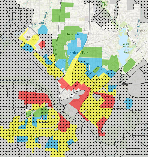
Redlining, combined with segregated public housing and the federally-incentivized white flight to the suburbs, have gutted American cities and created an unequal and unfair distribution of wealth among races. Remember, this was federal policy for nearly 34 years, until the Civil Rights Act of 1968 put a stop to it. Last year, the National Community Reinvestment Coalition released citywide charts that overlaid the redlining demographics with the existing economic conditions of neighborhoods. The map below includes the redlining designations in the various colors—green for “best,” blue for “still desirable,” yellow for “still declining,” and red for “hazardous”—but overlays it with data from the 2010 Census. The gray areas, enclosed in dashes, are majority-minority parts of town. The dots indicate where the median family income was below 80 percent.
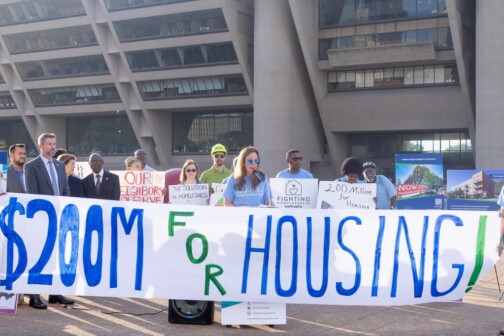
As Council member Philip Kingston tells Will, “the future is mixed income. But it requires diligence and not losing political will.” And part of that is understanding how we got here in the first place.