INTRO
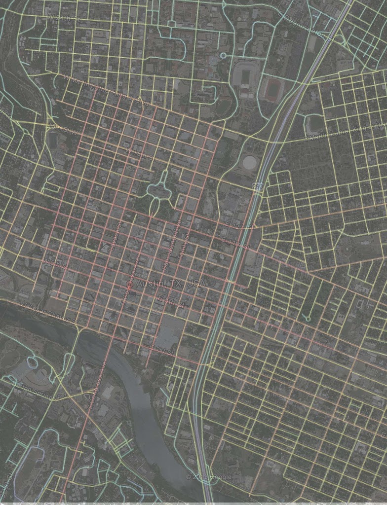
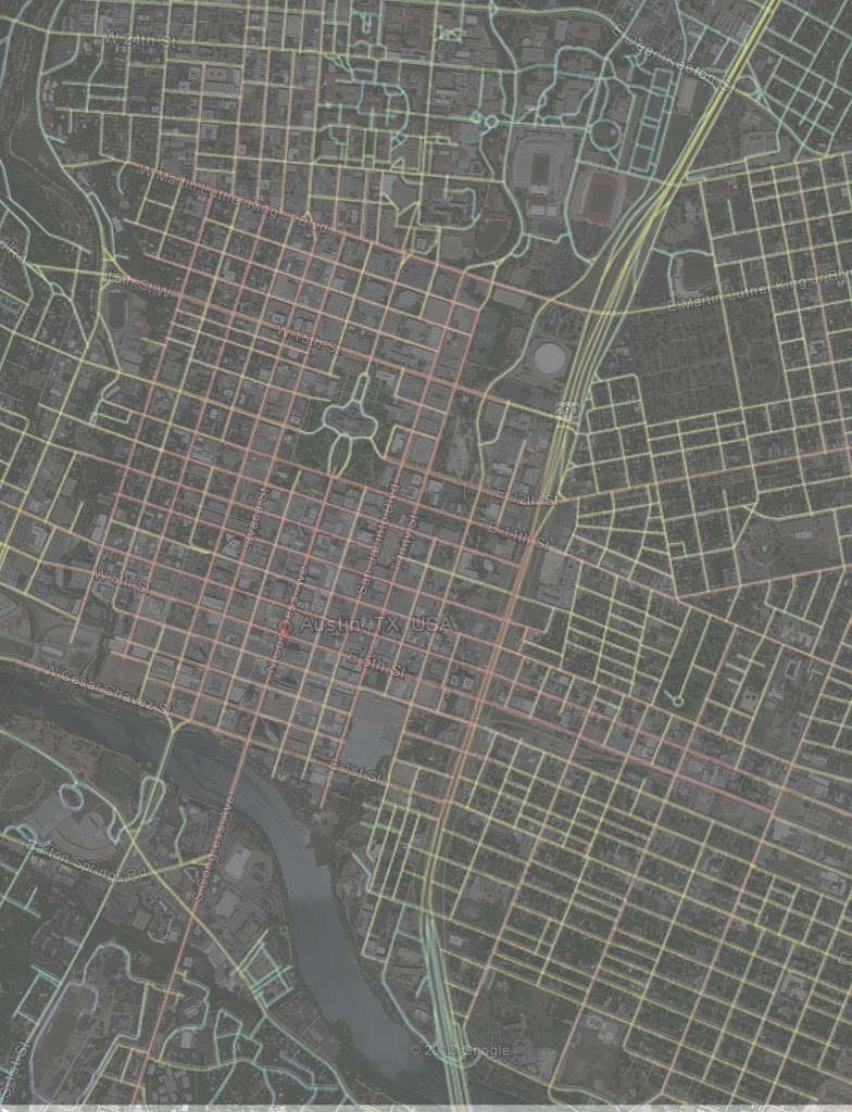
As you may know, a group called Reconnect Austin is proposing to “cut and cap” I-35 through downtown Austin. Cut means to essentially drop the road below grade and cap means to cover it with a boulevard (essentially what were the frontage roads), public space (similar to Woodall Rodgers and Klyde Warren deck park in Dallas except over several more blocks than the three that comprise KWP), and reconnecting the grid of streets between East Austin and downtown Austin. This study will use new quantifiable means of evaluation to measure the increased value of existing property due to the reconnecting of the grid and the open space replacing what is currently a highway.
The Reconnect Austin plan differs from A New Dallas in that they aren’t proposing to remove highway capacity. Their primary challenge is initial capital outlay for infrastructure for what I expect is a lower return than A New Dallas is projecting. On the flip side, their idea may be more politically palatable in that they aren’t removing highway capacity even though every city in Texas has an overabundance of what we can no longer afford while it subsidizes the long-trip and living outside the city.
They may be recapturing some right-of-way through tightening up the frontage road/highway section to highway below grade/boulevard on top. On the surface, it’s more about qualitative improvement of the area and its surroundings (by burying a freeway that is, by nature sociofugal – it disperses people and no one wants to be around it). Also, from what I understand the amount of recaptured right-of-way is a moving target at this point, therefore I’ve left that out of this study to focus solely on quantitative and qualitative improvement of what currently exists. At which point, we can then reasonably expect that increased value to the be catalyst for additional new development, but that is also left out of this study as it’s expected to be covered by every other projection being done by those working hard on this proposal in Austin.
Inner-city highways are more disconnective than they are agents of local connectivity. In other words, the grid is clipped except at certain cross streets. The effect is that highway frontage is really only valuable at those particular cross streets that link divided districts. Meanwhile, land that is along the highway but not at a cross street, actually has very bad accessibility. It may have visibility, but as little more than a billboard. This is why we’re seeing so much disinvestment and down-cycling of development along highway frontage. We assumed the same logic applied as always has with cities, that traffic equals value. But not if that traffic has difficulty getting to you, are passed you by the time they see your signage AND if that traffic is of an unsafe, high speed nature. Your property frontage is then worth little more than billboard ad space.
I don’t know the specifics of the ever-changing plan in terms of what NEW land can be recaptured from the right nor what NEW development will be induced through improved qualitative and quantitative (connectivity) improvements. Instead, in this post I’m going to 1) explore the negative effect that the highway has on property. For the remainder of this post, I’ll refer to this phase of study as ANALSYS 2) how the cut n cap plan improves connectivity and how that translates into a measurable increment of value for existing real estate. I’ll refer to this as the QUANTITATIVE phase of research and value projection. And, 3) how the decking with open space and a pedestrian scaled boulevard qualitatively improves real estate value. I’ll explain each of these in PROCESS below. This will hereafter be referred to as QUALITATIVE.
*Side Note: I believe they should also look at re-routing 35 along available right of way further east, either “improving” the 183/Bluestein Boulevard in transportation terminology from an arterial to a highway OR somehow coupling it with 45/130 toll road well to the east of Austin.
PROCESS
As mentioned above, there are three phases to this study: ANALYSIS, QUANTITATIVE improvement, and QUALITATIVE improvement. ANALYSIS only looks at the before, what is the effect on real estate based on existing infrastructure. QUANT and QUAL look at before and after conditions to find the increment of value created by the cut n cap and use existing studies as reference for the projections of value.
This will be explained in more detail below, however the ANALYSIS section looks into the existing development, land value, and improvement values in relation to distance from Congress Avenue (as proxy for the central spine of the city, or apex of the sandcastle if you will) as well as distance from 35.
QUANT uses spatial integration software and created a model of the street network before and after plan implementation. This mathematical model then provides a value for a blocks integration with its surroundings from which we can relate to land/development value and then associate an increment of value created with becoming more integrated and interconnected.
QUAL uses the Harvard study on the proximity increment to urban parks that I elaborated into the Klyde Warren Park study. More background on this can be found here and here. It should be noted that Austin CnC is much larger in its scope and impact than KWP and in the interest of time, rather than look at every single parcel, I must extrapolate data patterns over the larger area.
ANALYSIS on the Effect of Infrastructure Spines on Real Estate Value and Development
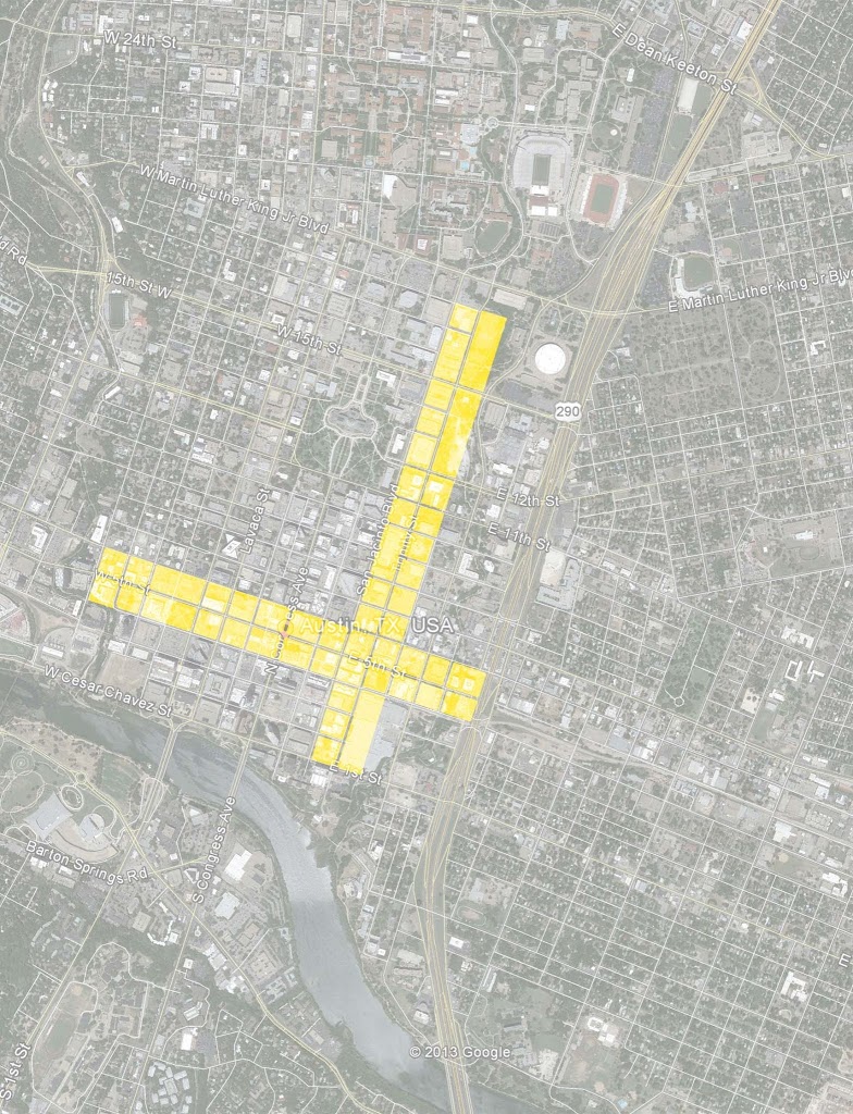
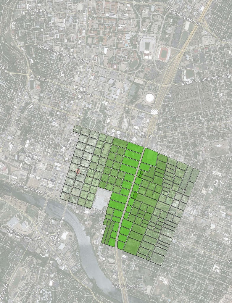
I began this portion of the study by identifying three (3) block wide segments of land between 4th to the south and 7th to the north in 7 block increments (the amount of blocks between 35 and Congress and Congress and where Shoal Creek begins to disrupt the fabric providing a natural transition between downtown and adjacent neighborhood. I used three rather than analyzing the full study area and would average the three together to somewhat ameliorate any outliers or noise based on one block having lots of development or none at all.
I then labeled these blocks ABC for between Congress and 35, DEF for 35 to Comal (where I used 8 blocks since the blocks closest to 35 are really only half blocks), and GHI from Congress to West Ave to the, duh, west. Then I numbered each 1 through 7 so that every block as an identifying label of A1 through I7.
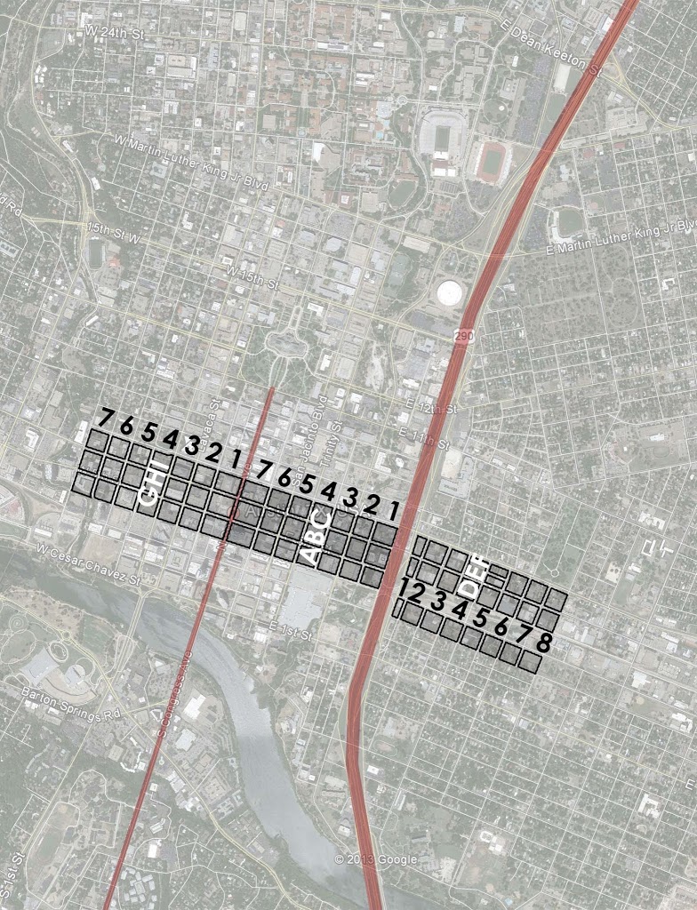
Setting the framework up in this way, I realized that F1 through F8 couldn’t be used because the land is occupied almost entirely by railroad and thus there is little to no development possible. To ensure I had contiguous, regular grid of 3 x 7(ish), I moved the F block south one block to between 3rd and 4th. I used 4th through 7th because this is the center of town, the center of the cut n cap, likely to be the most built-out and “mature,” as well as being the least disrupted by variegated grid (convention centers, big parks, twists in the grid, etc).
I set up three sets ABC, DEF, and GHI in order to compare what effect being closer to Congress or 35 might have on development and value, while being able to add or remove variables. Such as B1 and H7 are the same distance to Congress, both between 5th and 6th, but have far different distance to 35. What’s the value change? However, rather than look at isolated blocks where outliers are likely, I averaged the three blocks so that I could compare ABC1 to GHI7 or ABC4 to DEF5 which have the same distance to 35 but different distance to Congress. I wanted to know which has greater impact on value, the center of town (Congress) or the primary movement corridor (35). Which has more positive impact? What effect does distance have from either negative or positive inputs? Etc.
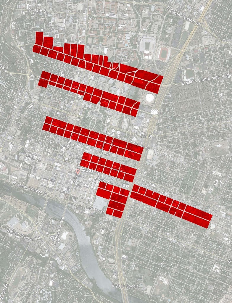
Next, I went through the Travis County Property Assessment website, traviscad.org, and looked up every single property within the 66 blocks of the study area. As you can imagine, this created for a rather large database as many of the individual blocks could have up to about 15 different parcels within them. This spreadsheet has over 600 rows of data for each parcel within each block. And it has about a dozen columns of data including land value, improvement value, property taxes, tax exemptions, land area, total built square feet, built square feet by use (so I can break down where land uses are going based on location), amount of surface parking, and total residential units.
CAVEATS
Now there are some necessary caveats I must make, some to do with the methodology, some to do with the availability of data, and TCAD’s limitations. First, and perhaps most frustratingly, TCAD doesn’t handle condominiums in a user-friendly manner. At least I haven’t found it if there is. Because there are many owners within a condo, TCAD doesn’t summarize all of the property assessment data. Nor is it particularly easy to find the individual owners. The best I could do was find 5-10 properties within the condo on trulia and try to extrapolate those to the entire development.
There is also some noise built-in to the study, because it’s built-in to the city of Austin. 1) Where there is historic preservation, there is a possibility that total built square footage is artificially depressed by policy. This may be offset by higher $ values per square foot. We’ll have to see as it plays out. 2) Austin, and particularly downtown, is a pretty incredibly hot market and has been for some time. 3) On top of and in conjunction with that, downtown was fairly depressed with the exception of the 6th street bars, gov’t buildings, and university presence. Meaning, where there may have been several acres of underdevelopment, within a year or two those blocks could be dotted with a few high-rises, but not yet fully built out. 4) In other words, it’s an area in transition.
BLOCK SUMMATION
Because of this potential noise is why I used a three block wide swath to average them together and hopefully mitigate some of that up and down variability in order to isolate the variable of distance from 35 and/or distance from Congress. So I created another database which was the summary of all of that parcel data, aggregated into totals for the block, which I then pulled for all 66 blocks into this new database.
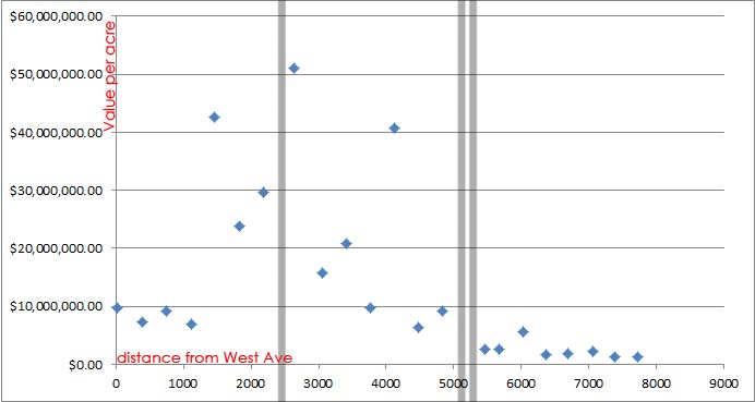
This spreadsheet includes all of the data from the previous spreadsheet, but then also includes formulae for acreage, FAR (floor area ratio of built space over land area), land value over land area, total value over land area, built value per built square footage, and percentage of surface parking over the total site area. These were all then averaged out for ABC together, DEF together, and GHI together. Each block also had measures for distance to Congress, distance to 35, as well as distance from “Point Zero” (0), which I set as West Avenue at near Shoal Creek so that I can create a graph of value that is literally a cross-section of the city as if we’re viewing it from Town Lake, only the various data points would replace the building heights of the skyline.
There are also several columns of data for spatial integration but I’ll cover that in the next section. First, let’s examine what’s existing and what we can learn from what effect Congress and 35 have on land and built values.
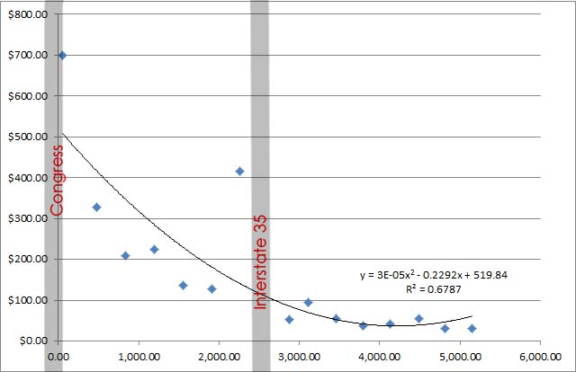
Above and below are the first two charts I put together in draft form for the presentation I gave in Austin. I didn’t have all the data in yet, but they are still pretty telling. Above excludes GHI blocks west of Congress, but you can clearly see the half-section “sand castle effect” as property value per square foot crescendos at the center of town, again Congress by proxy.
You can also see that spike just on the west side of 35, or the downtown side. This is one of the noisy points I was talking about, except it isn’t really noise due to transitional development as much as it is a direct by-product of its location, context, and the nature of highways. Highways disconnect the grid. By doing so, they tend to devalue most of the land along the highway which has lost some degree of accessibility and interconnectivity. But it also puts new value on the few crossing points, where exits from the highway meet linkages across the highway acting as barrier. In this case, it is 6th Street. And in that particular dot’s case floating up there all alone, it is a hotel that positioned itself right between the flow of visitor traffic into downtown and the Austin convention center.
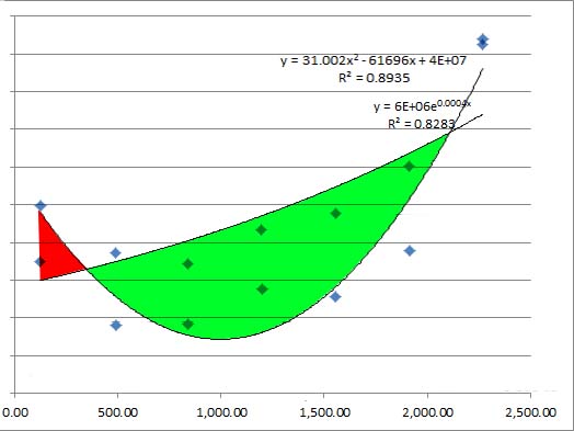
The x-axis above is now turned around. Imagine if in section, we’d be looking at downtown from DKRoyal Stadium with 35 on the left and Congress/downtown on the right. The two lines shown are land value (the more gradual arc and built value the parabolic U-shape, which you can see spikes by 35 due to that same hotel and then spikes in the center of town, providing that familiar conical (in 3D) or pyramidal (2D) shape of skylines.
What I’m showing in red is the value increment created by highway-oriented development. In green though, is all the value lost because development potential of this land is deflated due in some part to the parking/logistical/infrastructural needs of the “spiky” areas which might be considered over developed if they’re usurping the value/development potential of their surroundings.
——————–
Those were the preliminary results. Now let’s start looking at the more complete results.
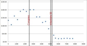
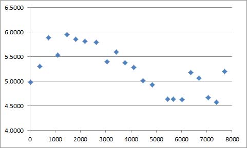
Shown above is the cross-section of land value per square foot based on distance from point zero, West Avenue. You can see how it crescendos at the center of town, there is a stark drop-off east of 35, and we’ll look into this in more detail, but it appears that value drops a bit more rapidly towards 35 (an edge) than towards Shoal Creek (which is less of an edge, but still has some disconnectivity to it).
*There won’t be any trendlines to the full cross-section. These are only relevant in the 7 block segments as properties approach Congress or 35, which seem to be the primary value drivers whether positively or negatively.
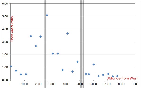
The next three cross-sections:
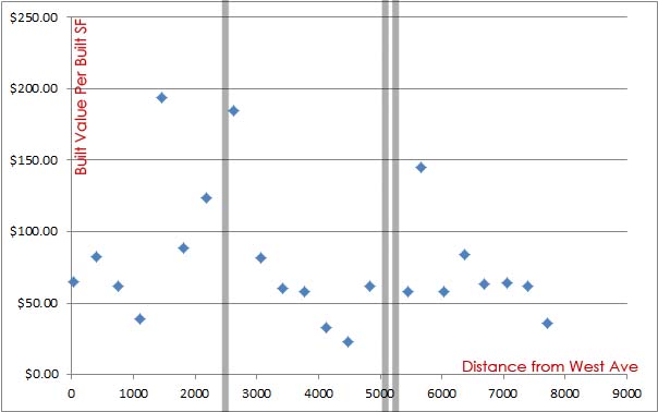
Last of the broad sections is built value per built square foot of improvement.
————–
Above is total built + land value per acre in cross section from Congress eastward. In order to give some relationship that 35 instills. Except it is difficult to tell exactly. The noise tends to come with the amount of development on a site, given the transitional nature of downtown and how hyperactive the market is on some blocks vs others, which remain parking lots or something similar.
Below I’m showing in blue the ABC blocks as they move eastward away from Congress. In red are GHI blocks from Congress moving westward towards West Ave. There are no clear patterns emerging whether one has more value or development. Though more new development seems to be in the works to the west while hotels inflate the east.
What makes it difficult to tell the exact value that 35, as it is currently designed, is that we don’t have any other scenarios to compare it to. Let’s hold that thought.
When we look just at land value per acre from Congress eastward you can see some very clear patterns. It’s almost as if there are two separate equations at work here. One for inside of the highway, one for “other side of the tracks” so to speak, just of the other side of the highway. However, it must be said that the upward trend towards the core starts one block east of 35, where the half block is. Whether that is due to the highway giving it some increased value due to the traffic and highway-oriented development despite its disconnective properties or whether that’s an overflow of downtown induced demand, it’s difficult to say. I have to expect that a smoother gradation from peak to the edge would have more inherent development value, eventual density, and tax base than the highway created dichotomy.
Unless we can run a simulation before and after and are able to associate a dollar value to the increment of difference in connectivity from the BEFORE plan to the AFTER plan. Which is exactly what I did.
————–
QUANTITATIVE Analysis and the Increment of Increased Value through Increased Interconnectivity
Now for the part where it starts to get interesting. We can’t really tell what kind of value the highway might be creating or removing because the effect it has might very well be impacting the entire study area. In other words, there is no discernible evidence that getting further away from the highway creates more value. However, there definitely seems to be a clear drop on the other side of the highway from downtown. Whether that is primarily due to distance from Congress or the relationship to 35 is difficult to say.
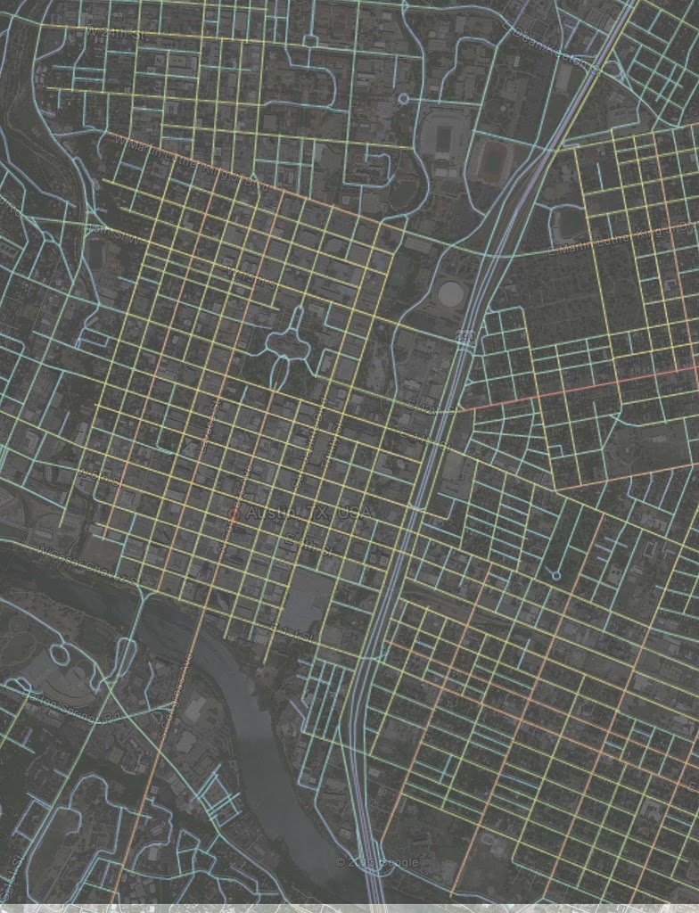
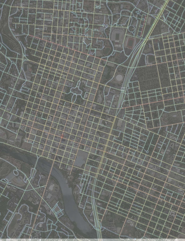
Fortunately, we now have spatial integration programs that mathematically measure degree of connectivity. We can input two systems and tell mathematically to what degree one is more connected than another. In this case, the two systems are the existing one with the highway and another where the highway is buried and the grid is stitched together above.
Having an integration value and real world dollar values, we can see what relationship there is between the two (if any) and see if it translates into a predictable formula allowing us to say x integration = y $ value.
Before – Local Integration (those areas most interconnected using less than 2 turns)
After – Local integration
Before – Global Integration (areas most interconnected regardless of turns)
After – Global Integration
Can’t tell the difference? Good, I barely can either at that scale. Fortunately, we have two things working for us. One of them is me. So I created a color coded map to simplify areas where colors ‘jumped’ from one code to another.
Primary local integration gains after cutting and capping I-35:
Primary global integration gains:
Let’s look at some of these relationships shall we?
—————-
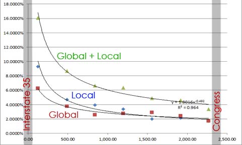
The first chart, immediately below, is total integration value (local + global) to the same cross-section shown above, from West Ave to Comal St to the east (right on the chart). As you can see, it’s pretty similar to the cross-sections above based on land and development value. It’s a little inflated to the east because of the way local interconnectivity is calculated in relation to global connectivity. So by simply adding them together it creates a bit too much noise in the system, or said in another way, it overvalues local interconnectivity.
We’ll get back to that in a bit. First, let’s stick to the degrees of interconnectivity in relation to the local geography and street network.
Below is showing the degree of increment AFTER is higher than BEFORE for local, global, and both. What it clearly shows is the restitching of the grid has a significant increase in degree of integration for both local and global connectivity and the degree is much greater closer to 35, as predicted, but there is still some increase further away, but the degree to which it increases dissipates, which is also predictable because of the relationship of proximity.
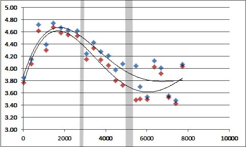
Seen as a cross-section throughout the system, below is not the increase but the total interconnectivity before and after. Before is red and after is blue. As you can see the greatest increment of difference is closest but there is an incremental gain throughout the study area. As always, unless labeled otherwise 35 is the thicker stripe through the chart.
Below is FAR to global connectivity. Or, the supply response of the market to the demand created by interconnectivity. Naturally, there will be a bit more noise here as there is another level of time and middlemen, the developers, at work and thus more time delay before equilibrium is reached. Beyond those caveats, there is still a discernible increase in development in relation to interconnectivity.
And lastly, is total development value per acre to degree of local interconnectivity. It doesn’t matter where we use local or global connectivity, value increases where both or either increases.
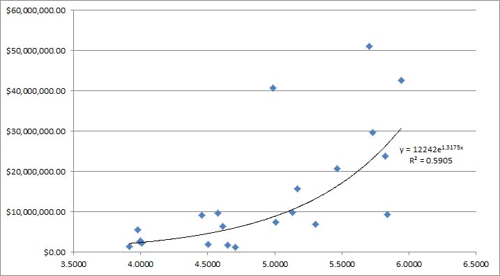
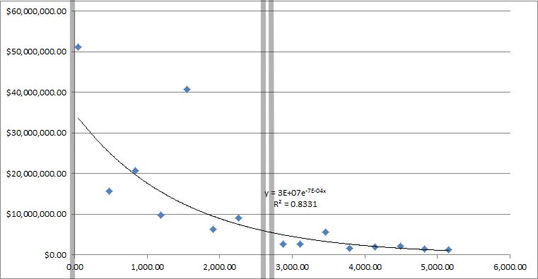
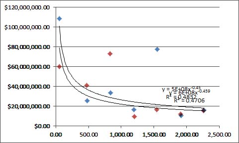
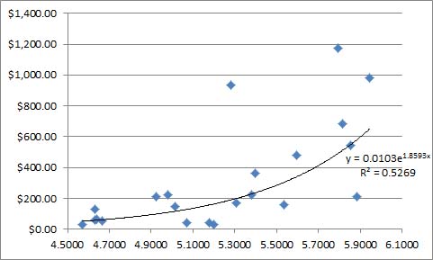
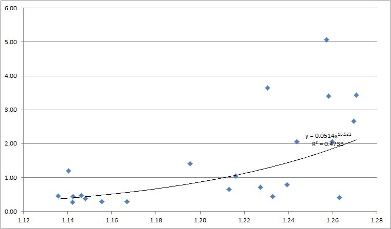
The question is, is there a dollar value that we can correlate to integration value. Because we have so much data we can create a number of formulas that connect integration value to land value, but we’ll go with one of those with the least amount of noise in the system. Doing so, we see an exponential relationship between interconnectivity and $ value by block.
For example, doubling integrative value results in more than double the value in land and development. Interconnectivity is thus superlinear. The value of urbanism is exponential.
Within the study area, before and after, we see integrative values between 4 and 6. Looking at each of those increments, we can interpolate with the formula:
Integrative Value Land Value per Acre
4 $760,655.73
4.5 $1,927,028.53
5.0 $4,881,891.78
5.5 $12,367,677.48
6.0 $31,332,002.65
In other words, if we can increase degree of integration, we end up with greater potential latent within the land. By cutting and capping 35, we create greater spatial integration, which creates greater value, which helps to pay for the infrastructure.
Again, this doesn’t calculate any new development, but rather the increased potential within land that helps make the new development happen. Rather than subsidizing development that often is necessary evil in infill locations, the “subsidy” is increased interconnectivity, which is the more logical, historic, and market-oriented way cities were and continue to get built.
Taking this formula, I used the degree increment throughout the study area and found an immediate increase in existing properties of $231,958,402.38 in property value.
———————
QUALITATIVE Value Increase by Removing Negative Impact of Highway
I’ve often written that there is both a qualitative measure to land value as well as quantitative. A simple analogy to this is the walkscore formula which measures only proximity of a variety of possible destinations within a presumed walking distance. It doesn’t however take into account the quality of the streets, sidewalks, or the experience of actually walking there. That’s the fine tuning knob.
In terms of overall value or walkability, regardless of which we’re talking about, the spatial relationship within the network is the primary driving force. Qualitative improvement adds to it. But you can’t have only the qualitative aspect without the quantitative. Quantitative is the foundation. Otherwise you’re merely decorating.
However, that also shouldn’t assume that qualitative improvement shouldn’t be taken into account. In the case of I-35 in Austin, it means removing the negative effect highways have on their surroundings from a more visceral perspective. They feel unsafe. They are unsafe and they’re undesirable to be around. This, in turn, has a negative effect on surrounding property. That of course is the qualitative aspect on top of the reduced accessibility, even though more cars are moving past, the quantatitive aspect.
Like with the Klyde Warren Park study I completed a few months ago, I’m using a blend of a variety of studies on value increment of proximity to parks on real estate. However, rather than going by segments like below, I used the formula (which resembles the arc shown below moreso than the brackets) and plugged that into the spreadsheet because there were so many more parcels. I just capped the formula at 25%.
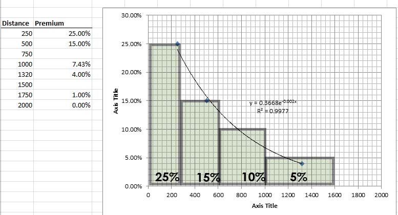
Roughly working out the distances from boulevard/deck park/open space cap that would go over top of the sunken 35 highway and the impact that the new open space would again ripple across the downtown and East Austin area as a gradient where the greatest impact on value is closest to the qualitative public improvement. This value diminishes to 0% as we get close to 1/3rd of a mile away from it. Perhaps not coincidentally, about the distance that walkability is lost.
The calculations were pretty simple for this phase of the study, because all of the other data is already in the spreadsheet. Moving it forward was just a matter of plugging the formula into the spreadsheet for the 66 blocks already quantified based on their distance to 35. The distance to 35, used to chart any impact 35 itself, was used as the input for the formula for the distance to the proposed open space replacement. This value was then extrapolated to the entire study area that would be impacted by new open space based on distance.
The result is a new value increment of existing property from improved public realm of $149,795,748.43.
Adding the two together (presuming that the qualitative open space increment based on studies is all qualitative and not in any way quantitative through improved connectivity — which is plausible considering the connectivity increment we’re using is entirely about streets)
Quantitative Improvement: $231,958,402.38
+ Qualitative Improvement: $149,795,748.43.
Overall Improvement of Existing Property: $381,754,150.81
Again, I feel it necessary to reiterate that this is only for property as it currently exists. This does not propose any new development, which would predictably result from the new demand instilled by the improved connectivity and public realm environment. New development would also likely occur due to any recapturing of right-of-way, so this figure should be considered on top of typical return on investment scenarios that don’t often take these factors into account.
—————–
CONCLUSION
Without looking at projections based on before and after street networks, using interconnectivity as a variable in the two scenarios, it is difficult to determine if and to what extent I-35 is depressing land value and development, if indeed it is. However, it is also hard to imagine that it doesn’t instill pressure for more parking while acting as one part dam against demand for infill development and one part diffuser, dispersing that demand to outer reaches of the city. In effect, pushing “affordability” outwards rather than inwards as a market response to a variety of segments wanting to be closer to the city center.
In such a scenario, it is also difficult to see existing parking, surface or garage as potential floor area that could be too valuable as something else without the highway corridor. I think all of the data and studies shown above show a pretty strong and direct relationship between improved interconnectivity and quality of public realm with increased value. The two work hand in hand. Of course, you also have to buy that there is indeed a proven connection between value with interconnectivity and/or quality public space. However, I’m riffing off of studies from University College of London and Harvard, so take it up with them if you don’t buy it.