You may notice our website looks a little nicer than it did last week. This isn’t a full-fledged, top-down, rip-it-up-and-start-again redesign, but it allowed us to do some neat things that I’d like to introduce to you.
But first, some kudos. Thanks go to Christina Rees, our lead developer, who coded the hell out of this thing. Ricky Ferrer, our former digital director who left us for Foreign Affairs in New York City, got the ball rolling with the early design. Jessica Chen, our digital art director, picked it up in his absence. Baker Ousley, our backend developer, and Emily Olson, production and design associate, both helped test the site before it went live.
The most impactful thing this allows for is the launch of a new section, known as D Living. The talented Caitlin Clark, one of our online managing editors, has spent years basically creating her own beat that we didn’t exactly have a place for online. It grew too wide. Much like FrontBurner, D Living is built around an audience instead of a single topic: hers being fitness, style, shopping, and wellness. The redesign gives that journalism an easy-to-find home, all grouped together. Check it out, and read more about Caitlin’s editorial strategy right here, in her own words.
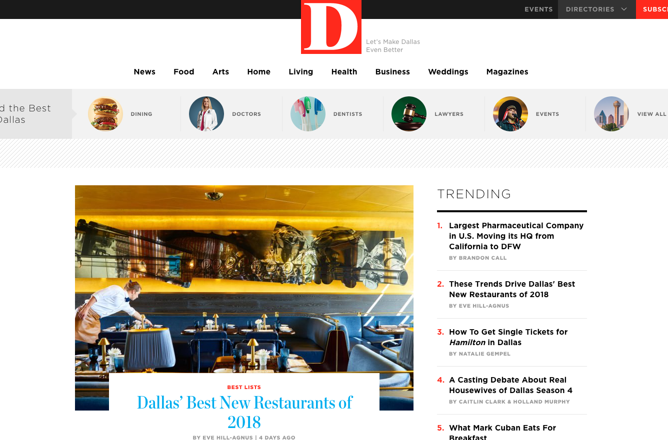
The other things you’ll notice are a bit more cosmetic. The nav bar is new and not so bulky. We’ve made it easier to access to our directories—Restaurants! Doctors! Bars! Dentists! Events!—now that they’re housed in buttons right below our various sections. We also made it easier to find content from our print magazines: there’s now a section for it in the nav, and a nifty widget a little bit further down the page with images of the current issue covers. It’s also easier to subscribe, both to the magazines and our newsletters.
Other than that, it’s mostly business as usual. It’s more refresh than redesign, and we hope you like it. If you have some feedback, you can email me here.