Analyzing education achievement in a geographic region can tell us plenty. It helps infer poverty or affluence, it identifies gentrification and segregation, it can point to the likelihood of crime as it can the prevalence of nearby economic opportunities. Where are the educated flocking and why? And what is it doing to those without the same levels of education?
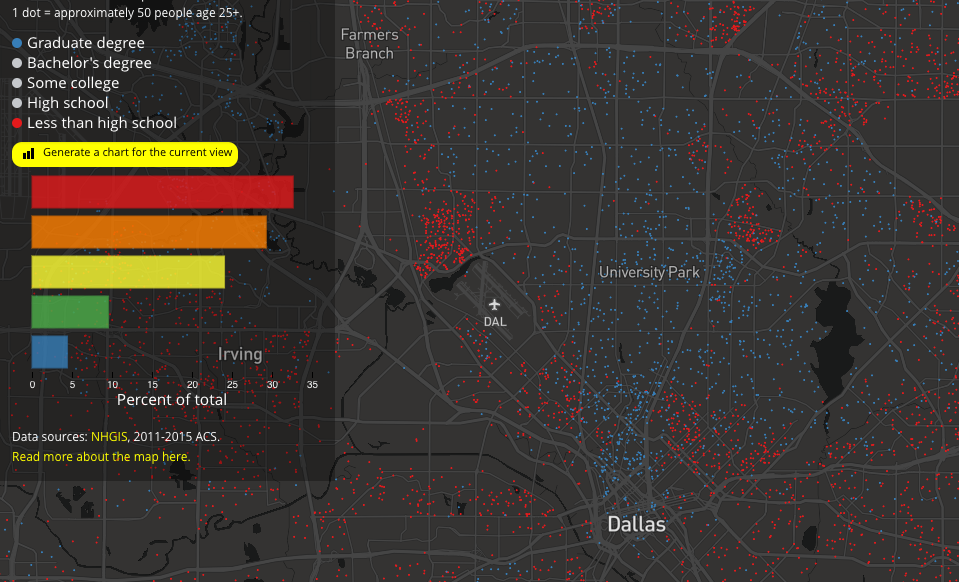
Kyle Walker, a PhD-holding geography professor at Texas Christian University, got curious about what it would look like if he mapped education attainment levels on top of some of the nation’s largest regions. And so he linked up GIS-coded Census data with confetti colors and let them rain down upon America. As he told The Atlantic’s CityLab, it helps identify the disparity in education between urban and rural areas, showing that the educated prefer cities. Perhaps not a surprise. It gets really interesting once you zoom in.
“Looking at urban cores, you see significant variation even from neighborhood to neighborhood,” he said on Wednesday. “In many cases, in more affluent, high-density areas, that’s where you’ll see the greatest level of educational attainment. … But the lowest educational attainment levels are also in urban cores.”
Walker says generally that graduate degree holders—blue dots on the map, each representing a cluster of 25 people—and those who lack a high school diploma—red dots, same cluster size as blue—are “generally speaking, geographic opposites.” A good example of that is the Park Cities compared to the area just north of Dallas Love Field on up through Farmers Branch.
But look at North Oak Cliff:

Look at East Dallas:
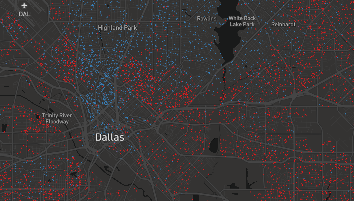
You’re seeing anecdotal cases of gentrification manifest through education attainment levels. This map uses data from 2015; it’ll be interesting to see the shifting demographics near Trinity Groves, which has seen large interest from developers eager to put up high-end multi-family housing near the restaurant theme park that now anchors the neighborhood.
According to a recent report by the National Low Income Housing Coalition, just 19 out of 100 rental properties in the Dallas-Fort Worth-Arlington MSA are affordable for households with low or extremely low income. That’s the sixth lowest in the country. Every state has a shortage—Texas has two of the most severe, in Houston and Dallas. City Hall, in fact, has been tied up for years in an ugly investigation by the U.S. Department of Housing and Urban Development over whether federal dollars that were supposed to pay for low-income housing did not.
Educational achievement can show where resources for both housing and schooling need to be allocated. Walker hopes the map brings to life these issues facing cities, visualizing them for people who may not be so inclined to pore through a spreadsheet of Census tract data. He also hopes it sparks conversations among policy makers.
“I hope city officials make use of it,” he said. “Based on my conversations with people in the community there is oftentimes a desire to have data that isn’t just tables and numbers, but data you can put up on the screen and interact with and use as examples in policy initiatives or just to spur discussion.”