Several weeks back there was a map of Major League Baseball fandom circulating. It was based on the preferences Facebook users had made public. It was disturbing to see how much of our country, absent a team in their own local market, had been given over to the cancer known as being a Yankees fan. It chilled me to the bone.
Anyway, several days ago the New York Times published an even more detailed look at that data, breaking it down to ZIP code level and creating interactive maps to show the precise geographic fronts along which two or more teams fight for dominance in the hearts of locals. (Thanks to the alert FrontBurnervian who passed along the link.)
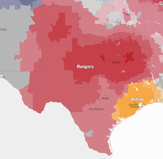
The Texas Rangers (as you can in the screenshot of the map above) own Texas. Except for the swamps in and around Houston, and the lunatics out in El Paso who’ve given themselves over to the Dark Side, the team in Arlington commands almost all of the state’s territory, plus a significant chunk of Oklahoma and a corner of Arkansas.
Even in the Astros’ home county, the Rangers command 9 percent of fandom. Contrast that with the Rangers’ home county, where the Astros aren’t even among the three most popular teams, polling something less than 2 percent.
Obviously the Rangers’ recent run of success coupled with the Astros’ last few seasons of futility have much to do with the reason “the Nolan Ryan Line,” as the Times playfully dubs this geographic division of fandom, is so much closer to Houston than Arlington. If we were looking at this data in the early to mid-Aughts (never mind that we couldn’t have because Facebook wasn’t a thing yet), when the Astros were regularly contenders and the Rangers were cellar dwellers, I’m sure much more of our state would look orange.
Check out the interactive map here. You can zoom in on your own ZIP code to see how many of your neighbors share your MLB proclivities.