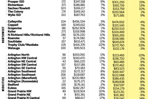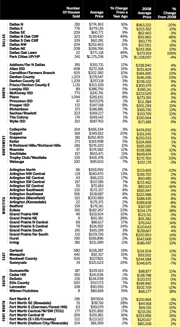

Let’s have a look at the first third of 2013, shall we? Except for the columns in yellow, this chart displays North Texas sales that closed between January 1 and April 30. We compared those numbers to sales from the same period a year ago. Then we had a look at how the area has fared since the same period in 2008 (the yellow columns). Don’t complain to us about the names of the neighborhoods; we followed the lead of the North Texas Real Estate Information Systems, which is the overlord of all sales data in our region. But, of course, NTREIS follows the lead of its constituent multiple listings services. In any case, the names and the geographic divisions aren’t ours. We are eternally grateful to NTREIS and to the Real Estate Center at Texas A&M University for their expertise and willingness to share.