First, some caveats because you have to finish your vegetables before you can go out and play.
I love DART and want it to be the best, most useful system in the country. It is an integral component to a multi-modal future and the city (and region’s) ability to compete (but mostly the city because transit systems function best serving the core). I am also fully aware of what drives ridership and in how many ways the built form of North Texas and its relationship to transportation infrastructure currently falls short. Some day I might spell out all of the components of ridership and where Dallas meets or doesn’t meet the criteria like I did with the 8 Components of Vehicular Travel Speed.
I’m using ridership numbers provided by DART. Since DART is a gateless platform system, it is difficult to ascertain ridership with 100% accuracy. I believe they occasionally use motion sensors to catch how many people get on and off trains and use that information to develop estimates. The data I used does not include the recently extended Blue Line to UNT Dallas campus off I-20 in Southern Dallas.
I was provided with average weekday boardings as well as Saturday and Sunday boardings per each station, which I put into a database to color code by line and add up weekly and annual ridership by station. Some stations have multiple lines due to the branching nature of the existing system. For these, I divided the ridership proportional to the line. For the downtown stations with four lines running through them, I apportioned the rides per line based on the proportional ridership of each line. Since each line was near 25% it didn’t make a huge difference in the overall numbers. Lastly, since the Orange line only runs peak hours north of LBJ station, I apportioned a quarter of those boardings to Orange and half to Red. That may be off, but it is a starting point.
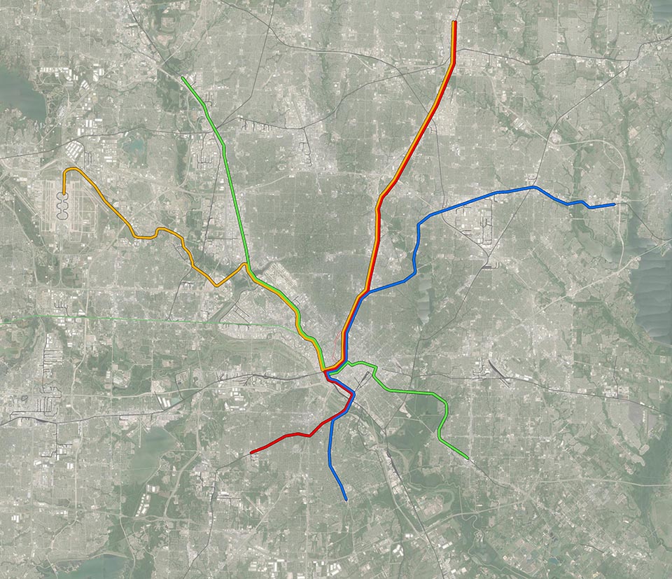
Yep, that’s the system. You can see downtown where the four lines merge. You can also see how much further the system extends to the north than it does to the south, which makes sense because there are more people and more destinations (and member cities) to the north than to the south.
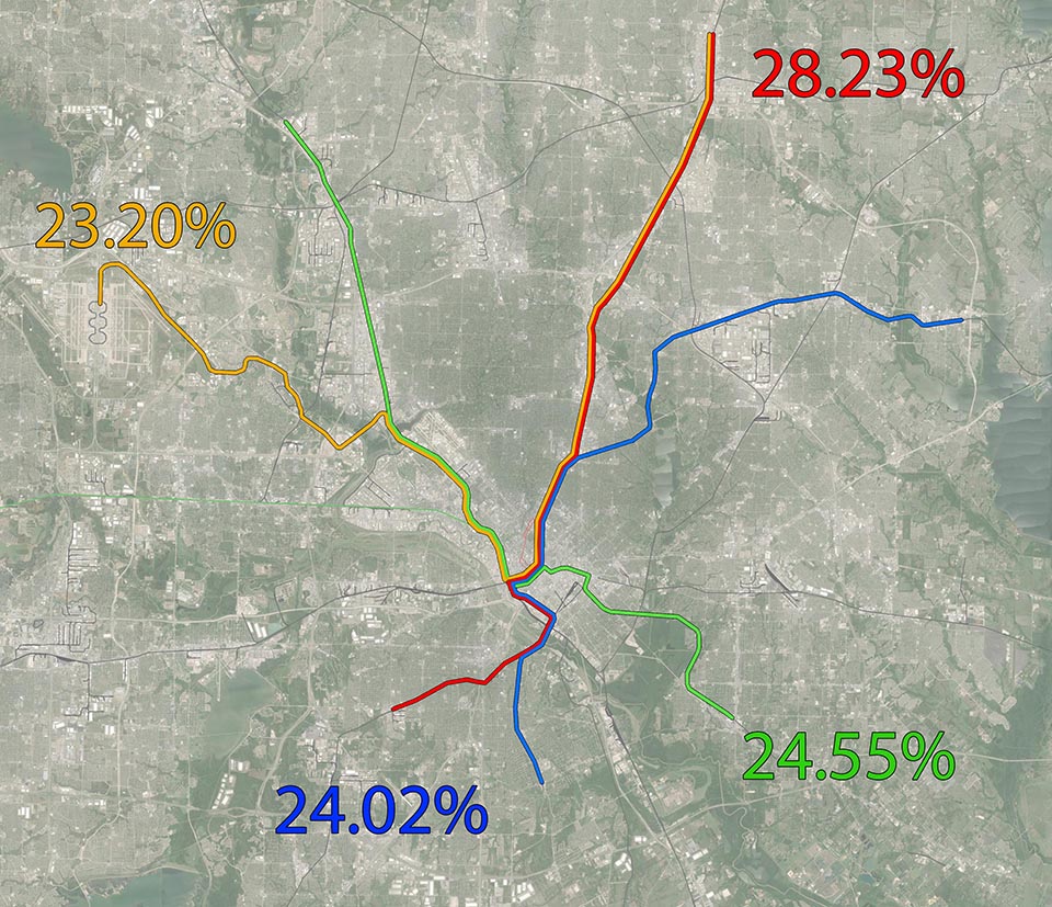
Amazingly (perhaps), the lines come out pretty even for ridership when each line is compared to how much ‘weight’ it carries in the overall system.
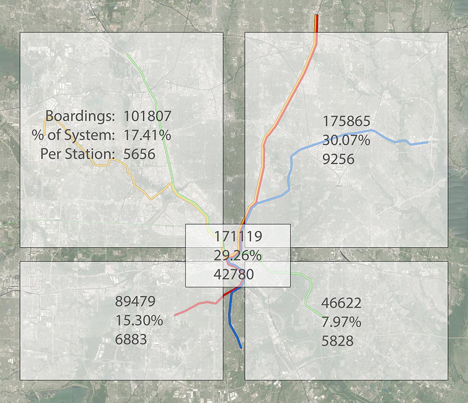
While the previous graphic broke down ridership by line, the above shows it by geography. In this, I’m only including the four stations downtown where all four lines meet in one trunk line. Since Union Station is only for Red/Blue, I’m considering it part of the Southwest quadrant. Just about 60% of the system is just downtown and the NE quadrant. If the system only included Red/Blue to downtown, it might be close to a profitable system. Of course, the point of transit isn’t profit, but to be useful and get people to their destinations safely, efficiently, and hopefully cost effectively enough that the system can be managed and expanded in a sustainable fashion.
Now let’s get to the fun stuff…
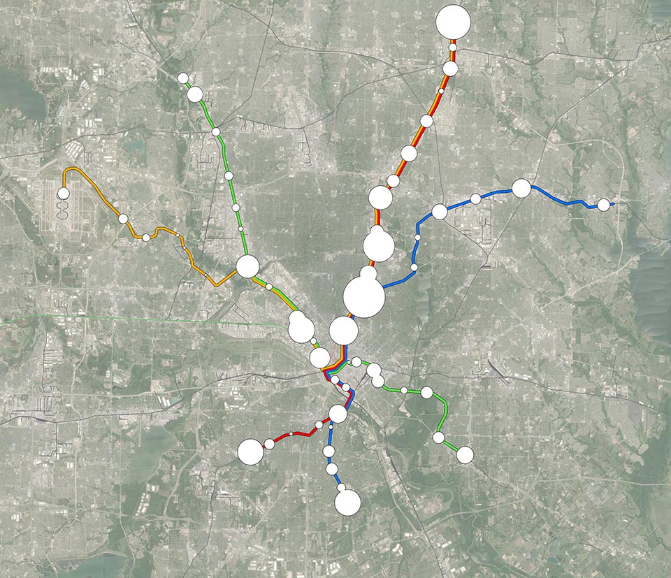
Above is the weekly ridership at each station to scale in order to compare one station to another and one line to another. From here, we can look at certain station areas and say, what’s wrong here? And begin further investigation.
I felt weekly ridership would give the most balanced comparison than just weekday since some stations are utilized more on weekends than weekdays. Pearl/Arts District station sees a weekend bump, presumably due to people riding in to the Arts District and Klyde Warren Park.
What is interesting and clearly evident from this graphic is the larger ridership of terminus stations. This is (presumably) due to end-of-line stations having a larger catchment area than mid-stream stations which essentially cannibalize from each other. You’re going to go to the closest, most convenient station to you. End of line stations will have less competition for riders. That doesn’t *really* occur on the blue line but also sort of does. The downtown Rowlett terminus has geographic barriers all around it limiting what falls within its catchment and how many can access it. If you draw a big circle around it and downtown Garland (second to last station), downtown Garland would have more households within it.
You’ll notice I didn’t include the downtown stations because they would overlap and make the graphic illegible. So here you go…
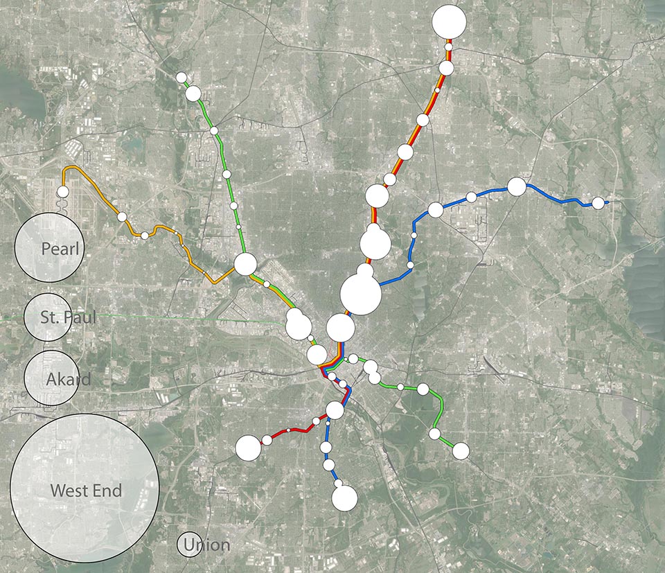
See what I mean? The West End station alone would cover nearly the entire core. For a system that doesn’t have very high farebox recovery (the percentage of revenue from ridership out of total operations costs – a useful metric to compare the relative utility of systems) and doesn’t have the job densities in the core (necessary for ridership) that other systems/cities have, you can still see just how important downtown is to the overall system.
Since very few would ride from downtown station to downtown station, the most boardings downtown could theoretically account for is about 50% of the overall system. That would be if all trips started outside downtown and finished within downtown and then vice versa for the round trip. That’s not how this nor cities work, but having 60% of that theoretical max of 50% is pretty high.
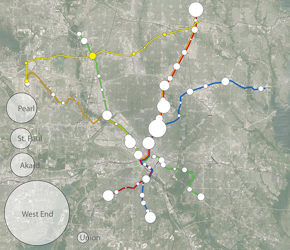
For comparison, I added the proposed Cottonbelt Line from Plano to DFW and its projected ridership using NCTCOG’s 2010 feasibility study for ridership. I scaled the projected average daily weekday boardings up to weekly boardings by multiplying by 5 (five weekdays, duh) and multiplying by 117% since roughly 84.9% of systemwide DART trips are weekday trips.