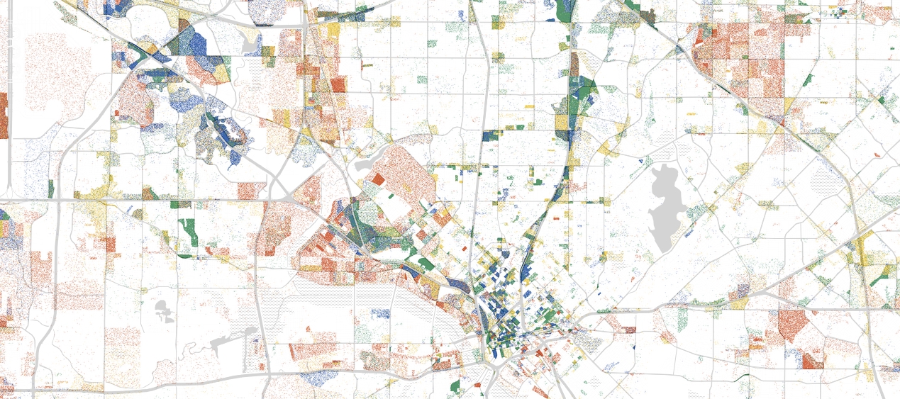
An alert FrontBurnervian (as they all are) points us to a cool, time-sucking interactive map that lets you look at every single job in the United States with a color code (you’ll have to navigate your way to Dallas). A guy named Robert Manduca, a Harvard Ph.D. student and mapmaker, put it together. Each dot that you see represents one job in Dallas. Blue dots are professional services. Green is healthcare, education, and government. Yellow is retail, hospitality, and other services. Go here to read a little about how you can interpret the data. One obvious conclusion is that downtowns are where the jobs are, not the suburbs. Here in North Texas, southern Dallas looks as barren as Prosper.
Get the D CEO Newsletter
Stay up to speed on DFW’s fast-moving business community with weekly news reports, interviews, and insights.
Related Articles
Arts & Entertainment
DIFF Documentary City of Hate Reframes JFK’s Assassination Alongside Modern Dallas
Documentarian Quin Mathews revisited the topic in the wake of a number of tragedies that shared North Texas as their center.
By Austin Zook
Business
How Plug and Play in Frisco and McKinney Is Connecting DFW to a Global Innovation Circuit
The global innovation platform headquartered in Silicon Valley has launched accelerator programs in North Texas focused on sports tech, fintech and AI.
Arts & Entertainment
‘The Trouble is You Think You Have Time’: Paul Levatino on Bastards of Soul
A Q&A with the music-industry veteran and first-time feature director about his new documentary and the loss of a friend.
By Zac Crain