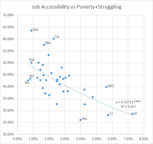
In the report Lost In Place, economist Joe Cortright writes that poverty is bad, but it’s easier to get out of when poverty isn’t concentrated. So I decided to map a handful of cities in terms of concentrated poverty. I used the ideas behind that as well as David Levinson’s work at University of Minnesota to chart access to jobs versus the percentage of cities that are poor or struggling:
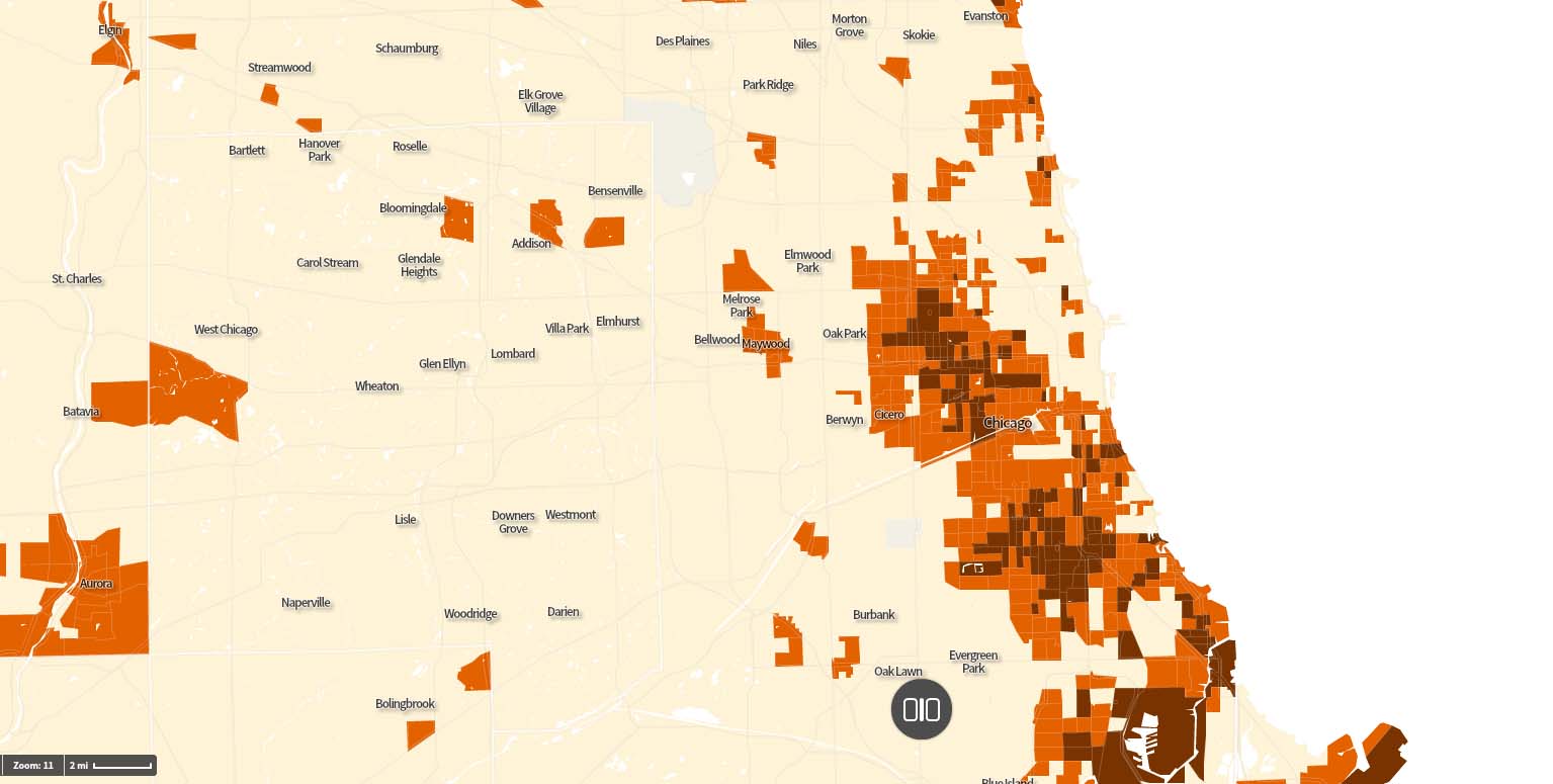
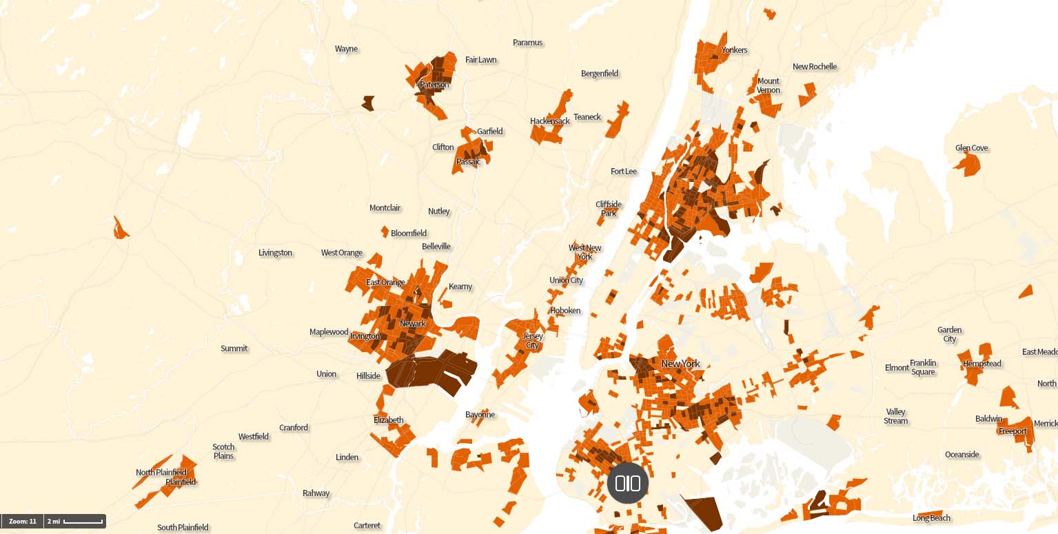
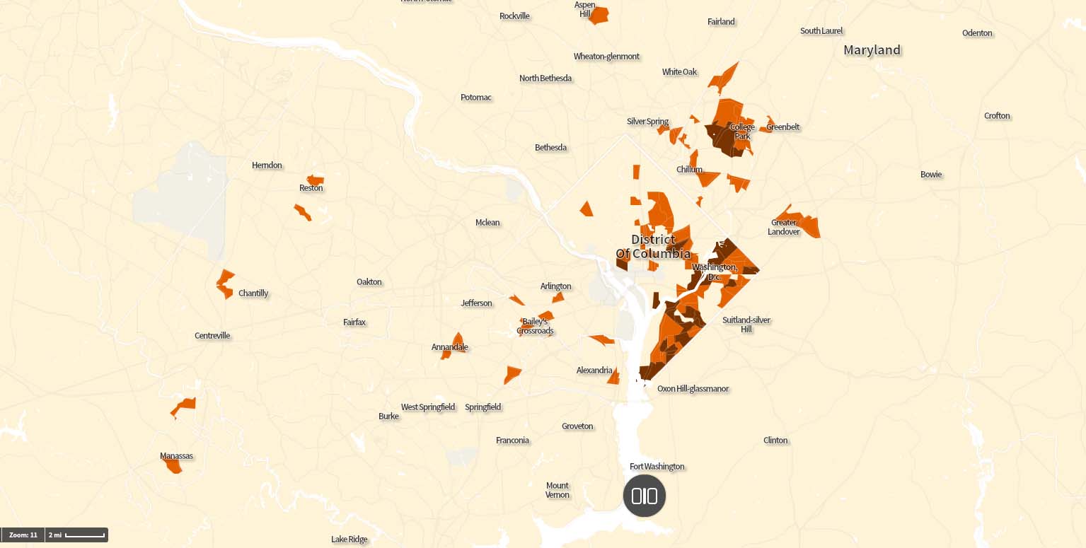
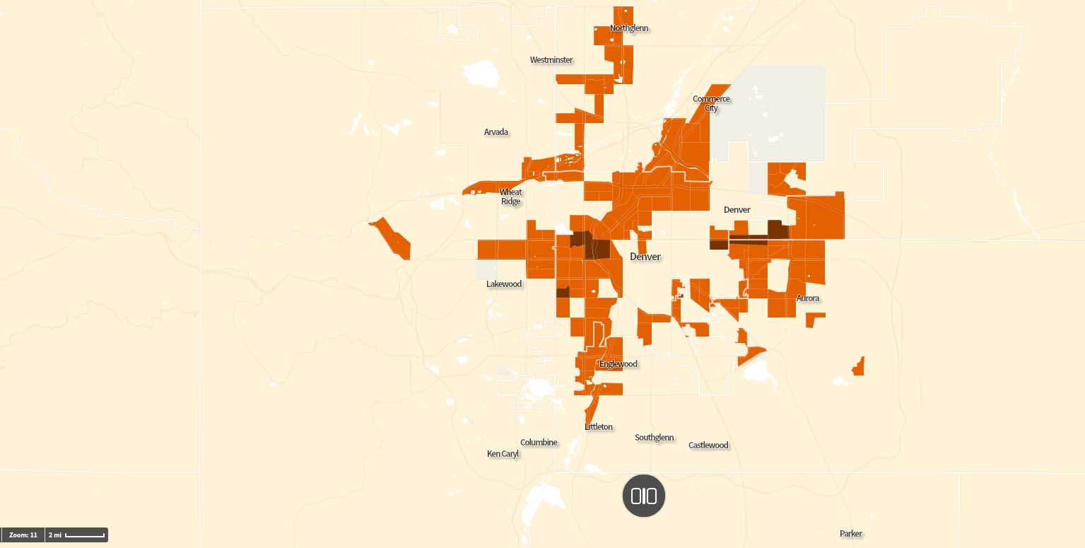
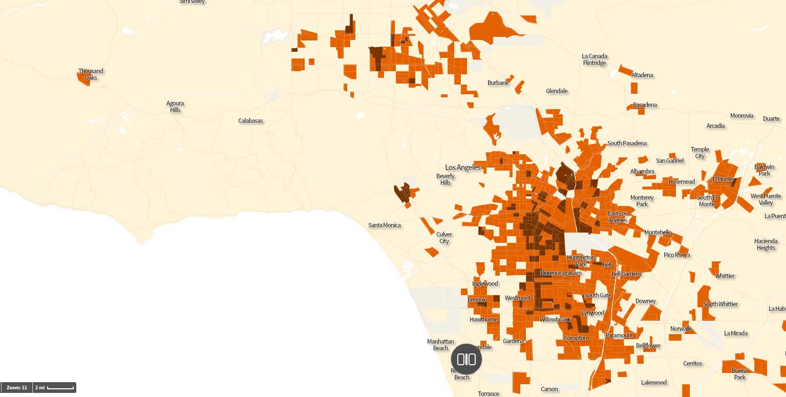
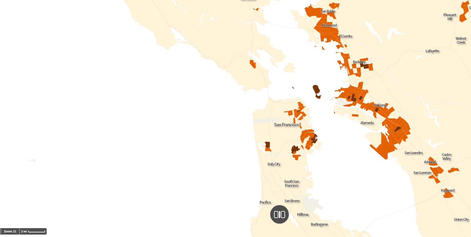
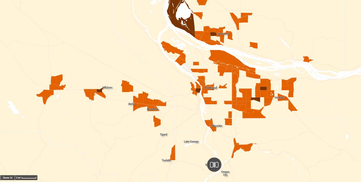
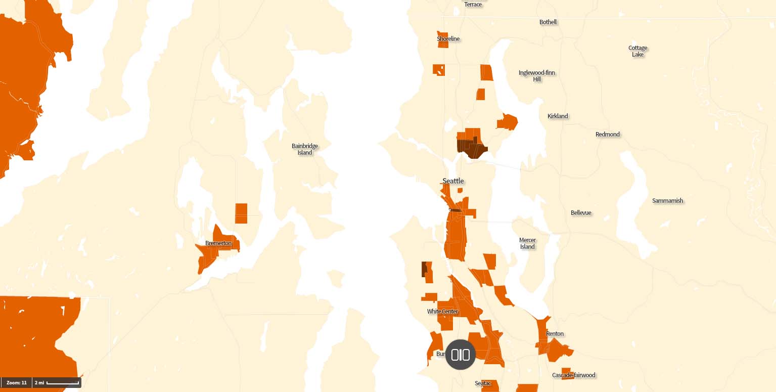
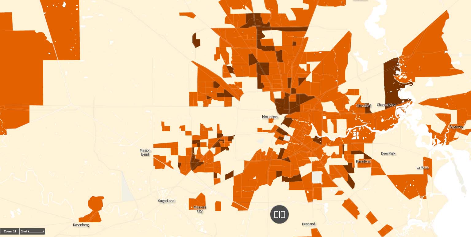
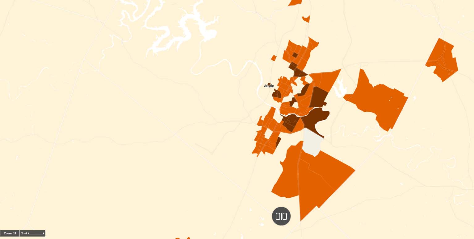
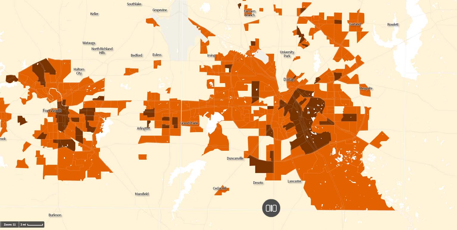
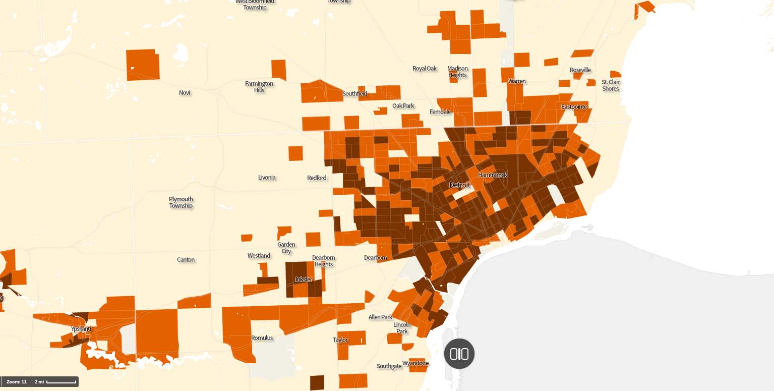
While that charts city vs city, it doesn’t get into map where the struggling are per each city. I mapped several cities below all to the same scale. Orange represents census tracts with poverty rates over 20%. In brown are areas with poverty rates over 40%. Census tracts are roughly 4,000(ish) people so larger tracts tend to be rural and small tracts are higher density: