
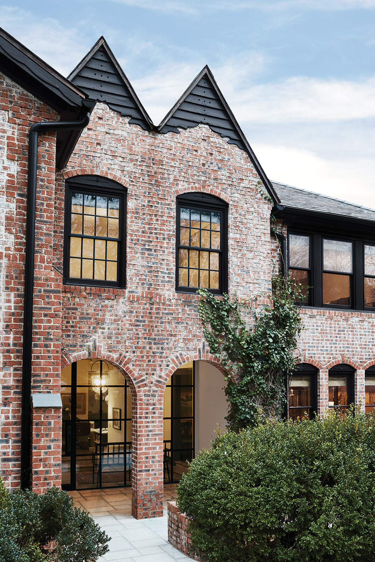
It’s not often that a young couple wants to renovate a space while also embracing the patina that comes with an older home. But in the case of this 1920s Tudor, its owner grew up in a 1910 farmhouse in Oklahoma. For him, there’s a natural comfort in aging quirks like creaky floorboards. Thanks to a bit of childhood history, finding a designer to honor the home’s provenance was one phone call away. The homeowner grew up with Ross and Corbin See of Sees Design, an interiors firm that was started by their father, Carson, in 1975. Corbin and Ross have experience working with this type of space. They lived it, actually. The brothers absorbed their designer father’s art of layered, eclectic spaces while growing up in an antique-filled, historic Georgian home in Oklahoma City. When Corbin married Sara, who started her textile career at Holly Hunt, and brought her into the fold, the design trio was complete.
But all good designers know that bringing in the right architect helps write the narrative. Enter Eddie Maestri. The architect and owner of Maestri Studio immediately connected with the homeowners over their affinity for Louisiana (the homeowners met and married in New Orleans; Maestri grew up there). But they all agree that working for clients who are invested in preserving the integrity of the 1920s time period was the best jumping-off point. “It was actually really good because they didn’t want massive spaces. They wanted the house to feel complementary to the original,” Maestri explains. Sara adds, “The homeowners are purists in that way. They have a real appreciation for history.”
To that end, the original formal living and dining room footprints were left as they were. “We got to use these spaces, whereas in some renovations they get carved up,” says Maestri. Thanks to an oversized lot, builder Greenwell Homes doubled the square footage with a two-story addition to the back of the house, which includes a kitchen, family room, and office space downstairs, as well as a master suite upstairs.
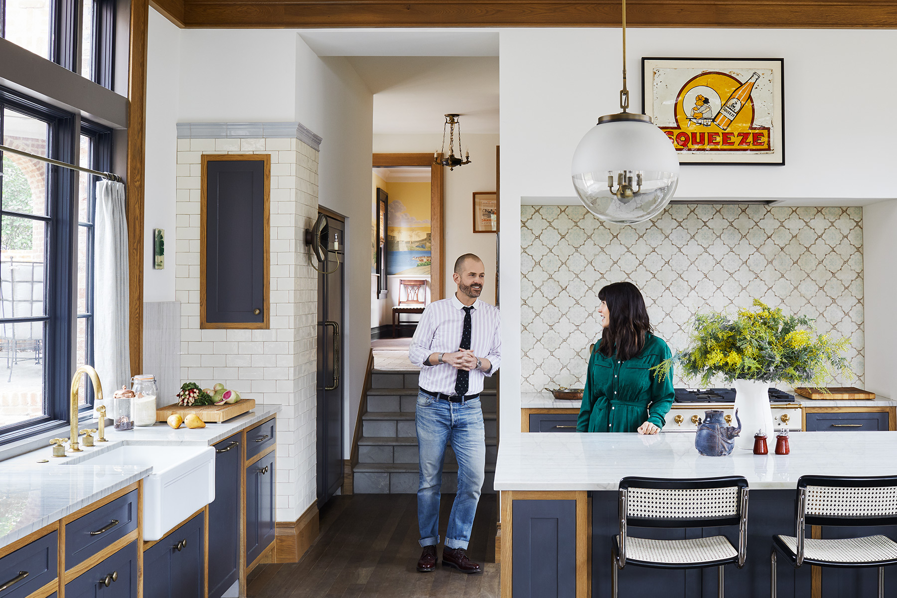
Maestri was mindful to nod to historical influences in the new wing, too. In the kitchen and family room, he was careful not to overscale the space, while also including details like heavy molding and subway tile columns that reveal a “civic” feel via the 1930s. “ ‘Civic’ is a good word Eddie came up with,” says Corbin. “Like the room could have been a public space or train station.”
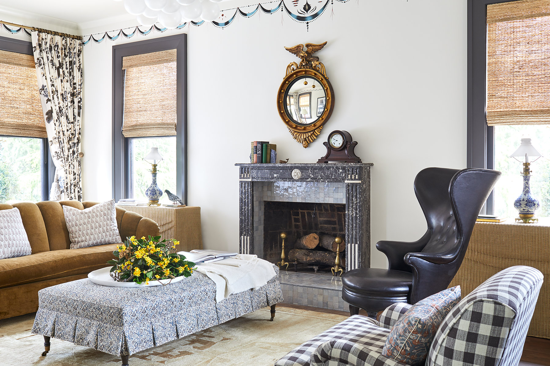
When it came to the design, the Sees’ strategy was to layer rooms that looked as though they were “artfully mismatched” over a few decades. They looked to New York–based design firm Roman and Williams for inspiration, even suggesting Maestri pick up their book. “We wanted it to look like this addition happened, and then we did the drapes, and then years later we did the chairs,” Corbin says.
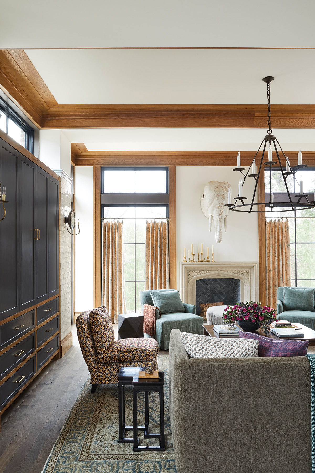
The home strikes a smart balance of honoring the clients’ wishes while still looking fresh, thanks to the Sees’ masterful art of mixing genres and styles. In the dining room, a midcentury Saarinen table sits with a hand-painted de Gournay wallpaper depicting a Napoleon battle scene. A light-filled study with modern, wood-clad windows boasts a custom floor inspired by a Sears catalog from the 1900s. And in the family room, Victorian-inspired lighting from Urban Electric hangs with a vintage elephant head.
Even fabric choices reflect the aesthetic, such as the archival Schumacher “Pyne Hollyhock” window treatments in the living room—not stuffy, but playfully nodding to a formal tone from the ’20s or ’30s. “I was dipping into textiles that I knew would touch on some of [the homeowners’] sensibilities,” Sara says. “I wanted to make sure the fabric represented the past.”
And if history does repeat itself, the team will work with this couple again. Says Corbin: “Getting to do something we don’t normally get to do with a client their age—that’s a privilege.”
Tips from Maestri
Create Tension
To replicate the Sees’ signature eclectic aesthetic, make sure that the room creates some tension. Place objects across from each other that don’t necessarily “match.” In the dining room, for instance, Corbin paired a midcentury Saarinen base with traditional dining chairs.
Open Up
To create more of an entrance, Maestri removed the original stucco wall and created an archway. He also opted for wall-to-wall steel window units for more light and continued the new stone flooring into the home. “We replicated the details on the front facade all around the exterior of the house,” he says.
Have a Sense of Humor
Levity in design is always a good idea. At first, the homeowners weren’t sure about a full-size vintage elephant head hanging in the family room, but once they lived with it, they realized it worked. “Those types of left turns add an element where the things in the room have a conversation with one another,” says Corbin. “Anything dark or a little creepy can have the same effect.”
Casual Cafe
For casual dining or sitting areas, hanging curtains at cafe height can allow for more light. But make sure that your ceilings and windows are tall enough. “Because we have higher ceilings and transoms above, we can afford to do it,” Sara says. “You have to be mindful of what other
elements are around you.”
Get Symmetrical
A second bay window added to the home’s architectural character. “We already had the box bay on the second floor in the master,” says Maestri. “So we were able to bump out that bay and create the perfect sitting area. It adds to the romanticism of the home.”
Make Light of It
In large spaces that have multiple light fixtures, be sure to focus on cohesive design and period. “Keep periods in sync,” Corbin says. “If you’re going to have a lot of lights in one room, I think that helps for congruency.”
Heat Things Up
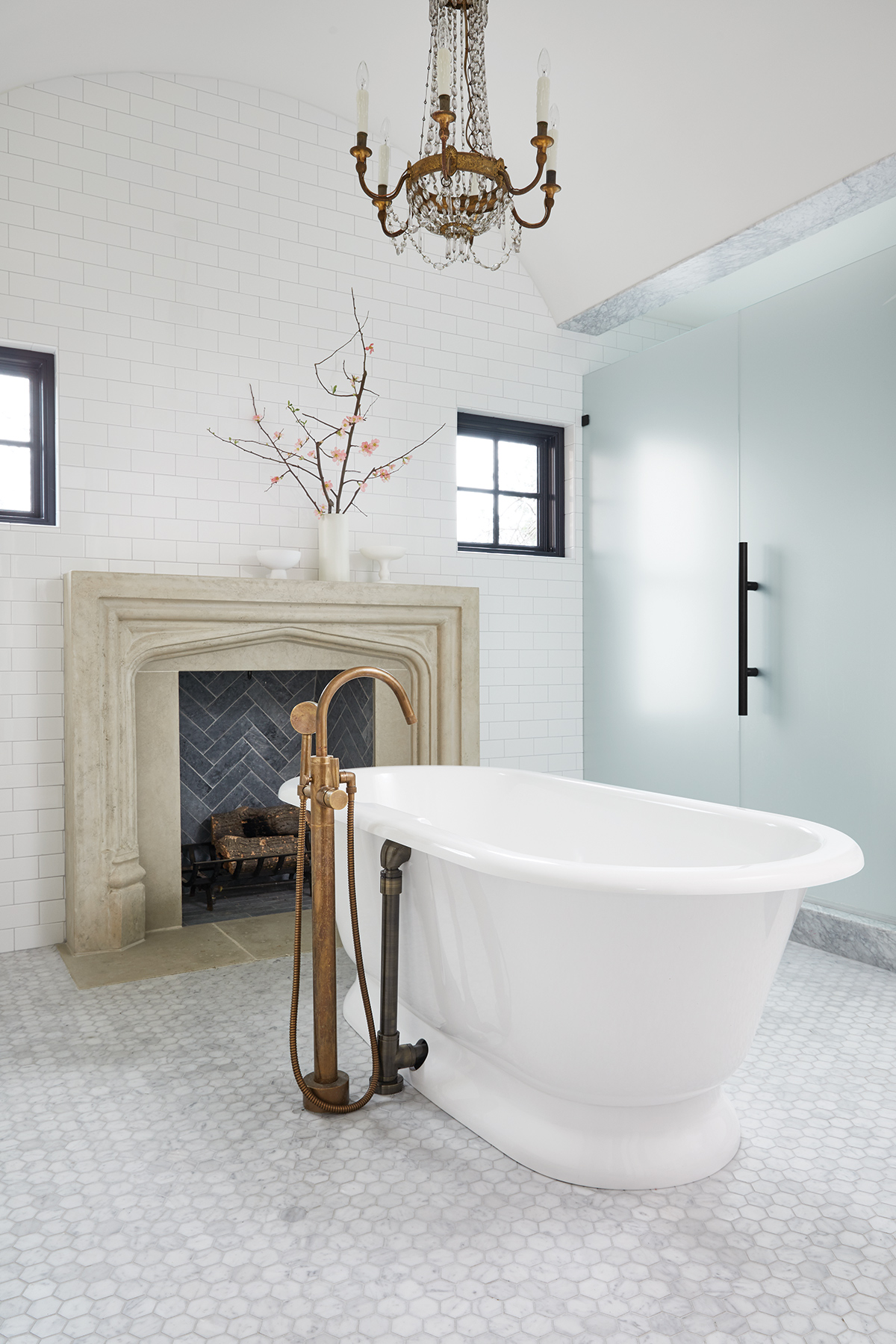
A fireplace in the bathroom? Why not? “Traditionally, you’d have a fireplace in the bedroom,” says Maestri. “We thought, ‘How great to have it in the master bath?’ ”
Time Travel
To achieve this historic-looking master bath, Maestri looked to suites of the past. “We wanted it to feel like a room that existed in the home, that a bath was [later] put in,” he says. “So we treated it like an en suite.”
Don’t Forget Antiques
Don’t be afraid to mix in the old with the new. One of the Sees’ hallmarks is adding an antique into almost every space. “I can’t stress enough that rooms need antiques for soul,” Corbin says. “If not antiques, good reproductions.”
Personalize the Size
Piece you love isn’t the right fit? Customization options abound. The Sees chose a full-size bed from Embree & Lake but had a craftsman expand the caning to the width of a king.