Last week, Dallas County declared monkeypox a health emergency as the disease continues to spread while officials scramble to meet increased demand for vaccines. Now, imagine you could pick a disease or condition and see its prevalence mapped in your community, county, state, or country.
Where is the spread? Who is most vulnerable? Where is there the most protection against the disease? Which communities have complicating factors that could make the condition more impactful?
These questions run through our heads whenever we hear about a new infectious disease or another COVID-19 variant. This information would be necessary for targeting resources for public health officials and policymakers. Now, a locally developed dashboard may serve as a template to transform how we visualize and address disease in our communities.
The Parkland Center for Clinical Innovation has long been on the leading edge of applying data science to public health and infectious disease information, allowing Dallas County to have some of the most accurate and targeted COVID-19 mapping and data in the country. The organization has tracked and mapped infection rates and vulnerability to the disease and shown how variants have spread throughout the community down to ZIP codes.
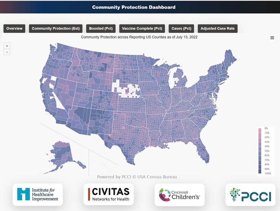
PCCI’s latest endeavor is a partnership with leading data-based healthcare organization Institute for Healthcare Improvement, the Cincinnati Children’s Hospital, and health information exchange Civitas Networks for Health. The organizations have joined to create a nationwide dashboard for community protection against COVID-19. The dashboard pairs COVID-19 infection and vaccine numbers to interpret how immunity may be waning. It uses demographic information to give nearly every county in the country a score that shows how protected these communities are against COVID-19.
Knowing how protected adjacent counties are for a sprawling region like North Texas can be especially helpful. Before launching the dashboard, a commuter from Denton to Dallas County would find it difficult to compare the COVID-19 risk between the two locales. The dashboard makes that much easier. It also allows viewers to toggle between overall protection, vaccinations, boosters, cases, and adjusted case rates.
A completely protected community would score 100, and the national average is 51.6. The range of scores nationwide is 41-83, and Dallas County finds itself nearly in the middle. Dallas County’s score is 60, with 39 percent of the community having received two doses of the vaccine and at least one booster shot. Dallas County fares slightly better than Tarrant and Denton counties but is somewhat less protected than Collin County, which has a higher vaccination and boosted rate than Dallas.
“The goal of the analytics within the dashboard is to contextualize what it’s being observed locally to what is happening concurrently across surrounding counties, state, and nation,” said Steve Miff, President and CEO at PCCI. “We intend for these insights to help provide a local dynamic vulnerability awareness with a national contextualization and use it to help identify emerging trends and forecast impact based on cross-region comparisons. Local cross-country/region collaboration and communication can also be enhanced with these additional insights.”
The U.S. is headed toward a fall and winter where the immunity of those who have been vaccinated or infected will be waning while dealing with variants that are particularly skilled at sneaking past the immune systems of those who have been vaccinated or had the disease recently. Those factors could make a dashboard like this critical for individuals as well as state and national public health officials when deciding where to send vaccine boosters, or resources to help hospitals deal with potential surges.
But the real upshot of this technology may be its ability to be applied to other diseases and conditions. The template used to create the COVID-19 protection maps could be used to analyze diabetes, hypertension, asthma, or a combination of diseases. For those working to address chronic illness on the ground, Miff believes having a block-by-block analysis of who is vulnerable could prove valuable.
This data could be necessary for everything from locations of vaccination clinics to public transport drop-offs. Grocery stores could choose where they are most needed, community clinics could use the data to guide new openings, and educational and advocacy organizations could know where to target their efforts. The possibilities are nowhere near limited to COVID-19.
“What we’re able to do is take an individual with a disease and geomap them, “Miff says. “Based on their block characteristics relative to housing costs, income, internet access, or other metrics, we can better understand barriers to healthy outcomes. Where are people with a specific condition or disease? Are they concentrated in different parts of the geography based on where they live? What barriers to access do they have based on these social, economic, or family-related factors?”
You can check out the COVID-19 Community Protection Dashboard here. Select a factor like “Community Protection,” “Boosted,” or “Cases” and explore.
Author