Eric Fischer is an interesting guy. He occupies a curious space between mapmaker, artist, and programmer. The maps he creates have been shown at the Museum of Modern Art and published in Wired and Popular Mechanics. He has worked as a software engineer at Google, and he was an artist in resident at the Exploratorium in San Francisco. The hybridity of Fischer’s talent and work reflects the way in which the digital saturation of lived experience is upending the traditional boundaries and definitions of expressive disciplines. Artists can use code as their palette. Programmers can create images and objects that shift our perceptions of reality.
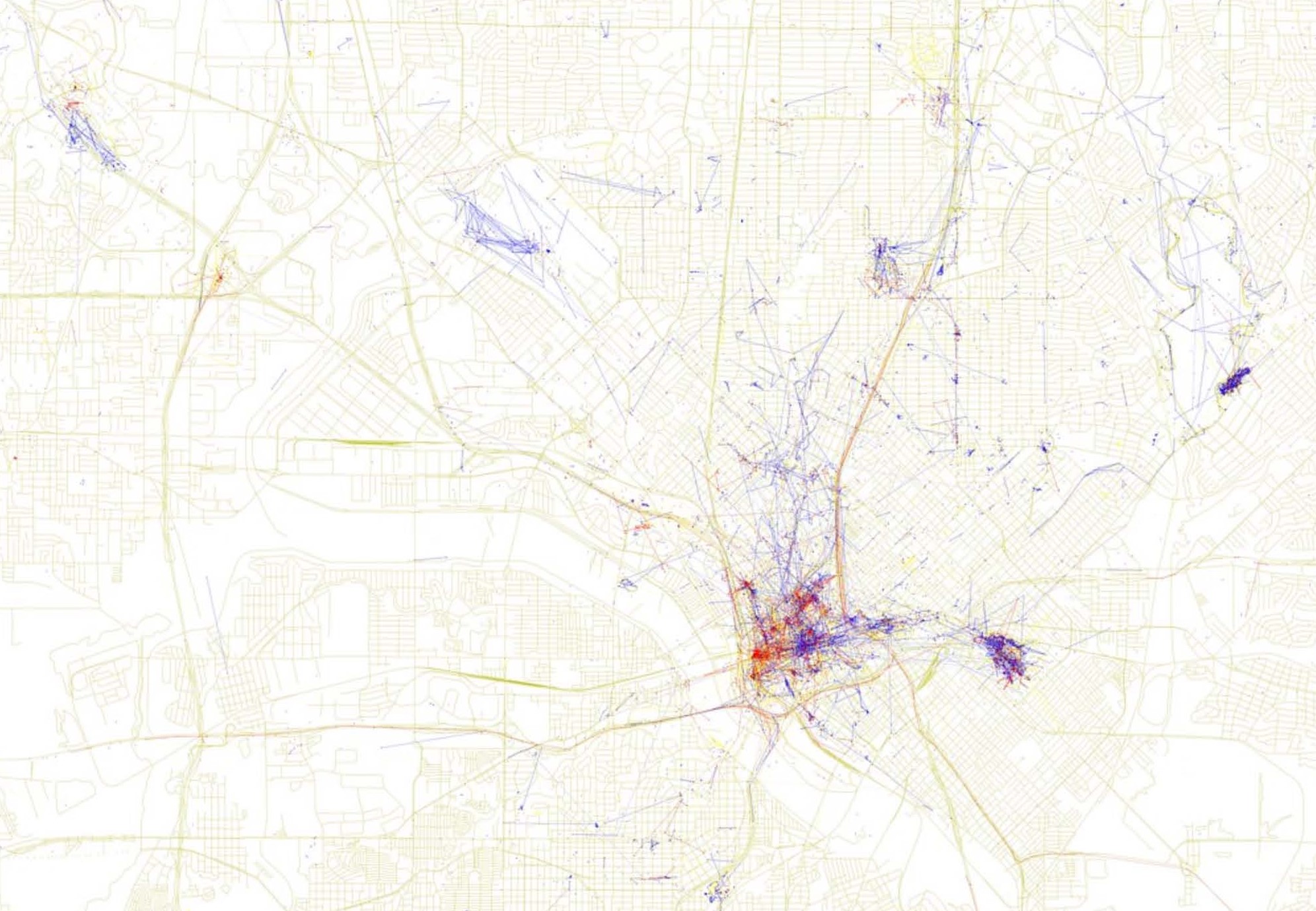
Or, sometimes, they just create cool maps that will destroy your Friday afternoon productivity. One of Fischer’s latest projects (h/t Candy’s Dirt) aims to understand how cities are perceived by tourists and the people who live there. Mining data from MapBox and Twitter, Fischer captures the locations of photographs taken by people in dozens of cities throughout the world and then overlays geographical information on the street grid. If the photos were taken by someone who lives in the city, they are marked on the map as blue. If the photographer is from out of town, they are marked as red.
The result is a set of maps that offer a sense of the divergent ways in which tourist and locals experience place. In the Dallas map, red tourist blotches cluster around the West End of downtown and smear into Uptown. Local blue dots center around the Main Street District and blur through Deep Ellum into Fair Park. Zooming out, and the blue marks bleed up through uptown and pop up in unexpected street corners or at White Rock Lake.
What can we learn from Fischer’s maps? I’m not entirely sure yet. To a certain extent, they show how cities are experienced differently depending on your relationship to a place. But I believe we need to start to understand the maps by first thinking about what the data used to create the maps reflects. They don’t tell us where tourists and locals go, per se, they show us where tourist and locals decide to take pictures. You might say that the maps mark out the places of significance or importance to the people who live in or visit a place. These are the places that stir us, move us, or make us want to preserve. They are also the places we seek to associate ourselves with by snapping a photo and slapping it up on social media. Or, they are the places where we go to celebrate or mark moments we want to remember or broadcast.
I think the maps are most interesting and useful when comparing various cities. You might see the intensity of red or blue smears as offering a geography of urban vibrancy or civic beauty. Unsurprisingly, cities like New York, London, or Paris have a mix of red and blue that is more intense, pronounced, and dynamic than Dallas’. What does this say about the way both tourists and locals regard and experience a city? How could these kinds of maps affect the way we think about designing urban space to generate vibrancy and urban vitality?
In his book The Other Paris, Luc Sante writes at length about the figure of the flâneur, a French term that loosely means wanderer, stroller, saunterer. The flâneur is a self-consciously aimless figure–she is never quite lost nor does she know where she is. For Sante, the flâneur is a creature of the vibrant city, taking pleasure in the way in which the streets themselves offer a space that stage directs the spontaneity of life, where a willingness to lose one’s sense of direction rewards in new discoveries. When I look at Fischer’s maps, I see a geography of the contemporary flâneur. The maps show how we wander through cities and which cities inspire wandering.
There is another layer to the project which I find a little eerie: the existence and availability of the data itself. These maps are a reminder that we carry around devices that are changing the ways in which we experience space. The inclination to reach into our pockets, pull out our phones, and snap a photo represents a new way in which we engage with our surroundings. The maps also show that as we add this digital layer to our experience of space, we are simultaneously participating on some level in turning our phones into surveillance machines that track our every movement. Fischer’s maps remind us that we are always self-surveilling and creating records of our movements. But they also show that the idea of the flâneur—the semi-lost urban stroller—may be a fading concept. We are no longer ever lost. We are always checking back in with the databases and servers that track our every move.