Of the tens of thousands of words written about our local elections, very few of them have focused on the aesthetics of each campaign. This is a shame. It is the aesthetics—the visual choices, colors, slogans—that can resonate with voters far quicker and longer than any particular policy position or campaign promise. This is perhaps seen most clearly with two of our most recent presidents: Barack Obama and Donald Trump. President Obama’s breakthrough campaign in 2008 introduced the slogan “Yes We Can” and the Shepard Fairey-designed Hope poster. Similarly, it is impossible to imagine President Trump’s 2016 campaign without the slogan “Make America Great Again” and the signature red MAGA hat. For their respective followers, these images, slogans, and merchandise became shorthand for the movement and the candidate’s politics themselves.
Dallas’ municipal elections obviously exist on a smaller stage. The two runoff candidates for Dallas mayor—Councilman Scott Griggs and state Rep. Eric Johnson—do not have the most appealing campaign signage. But this was clearly not a hindrance for them.
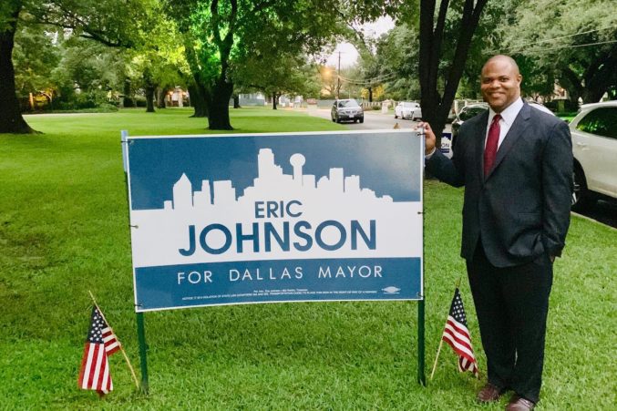
Johnson’s sign features his name in blue, centered on a white outline of a traditional skyline of Dallas with a navy blue background. Below the skyline is the phrase “For Dallas Mayor,” telling potential supporters what he is running for. And by positioning his name in the center of the skyline, one can glean that Johnson sees himself as centrist, and perhaps a candidate looking to unite the city. The blue color is clearly a nod to the fact that he is a Democrat (Dallas municipal elections are theoretically nonpartisan). There is also a version of this sign with a red background, perhaps a tip of the hat to Johnson’s bipartisan support in the race.
However, the blue version appears far more frequently (especially in Johnson’s own Instagram feed). The meat-and-potatoes nature of the sign is meant to communicate simply and succinctly what the candidate is about. It is also incredibly boring and perhaps a bit vacuous—the Aaron Burr of campaign signs.
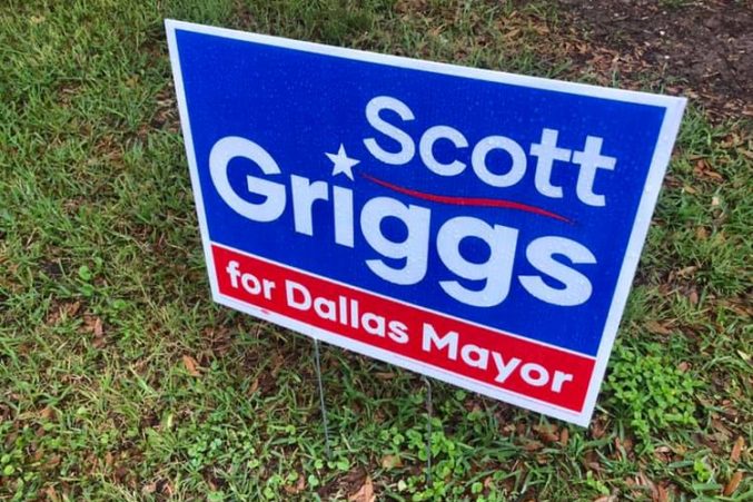
But if it’s really meat and potatoes you want, clear and simple, it would be almost impossible to make a political sign more straightforward than Griggs. It is aggressively plain. His sign includes his name in white lettering on a blue background, and the phrase “for Dallas Mayor” in white lettering on a red background separated by a thin white line. The dot over the “i” in Griggs is in the shape of a star, and there is red mark that resembles an elongated tilde over the double gs of his last name.
The red, white, and blue palette invokes patriotism, bipartisanship, and is more conservative than one may think a Griggs sign would be. The lone star eye is a nod to Texas and the tilde perhaps a subtle nod to the Latino community. It is straightforward, not fussy, and could have been designed in Microsoft Word. It feels workmanlike; it makes me want to buy a pair of boots and a truck. Griggs supporters wear this sign as a T-shirt and seem unironically happy to be doing so. If I had to describe it in one word, I would say it is normcore.
This year’s mayoral and City Council races had plenty of boilerplate political signage. But this election might represent a tipping point for a move away from traditional, red, white, and blue campaign signs. Specifically, many Latino candidates eschewed the standard format in favor of bolder and brighter colors. They filled their signage and campaign literature with the oranges, pinks, purples, and teals that are more often found in Latino communities in Dallas.
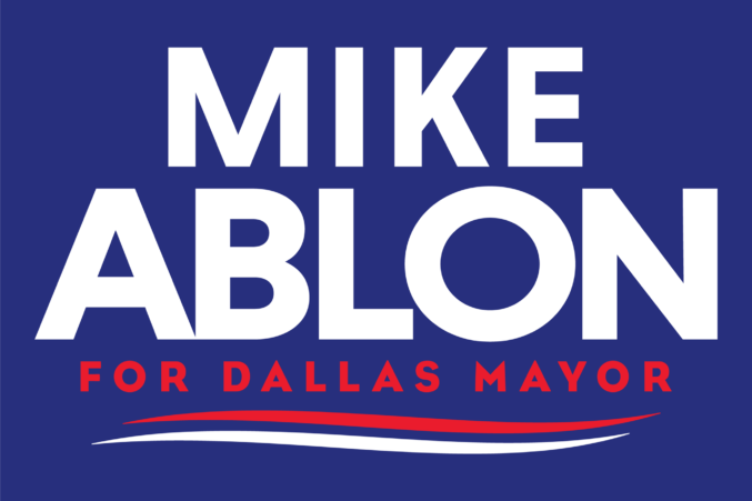
There are a few versions of political signs that annoy me. I don’t like signs that are primarily just the candidate’s name—like Griggs and Mike Ablon. Ablon’s is somehow even more generic than the second place finisher; his name was in blue on a white background, the phrase “for Dallas Mayor” underneath and then two swooshy marks. There is an alternate where his name is in white on a blue background. Two, I also don’t like signs that have a picture of the candidate on them. Three, signs that are too busy—too much information, graphics, or pictures—are off-putting.
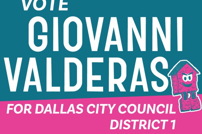
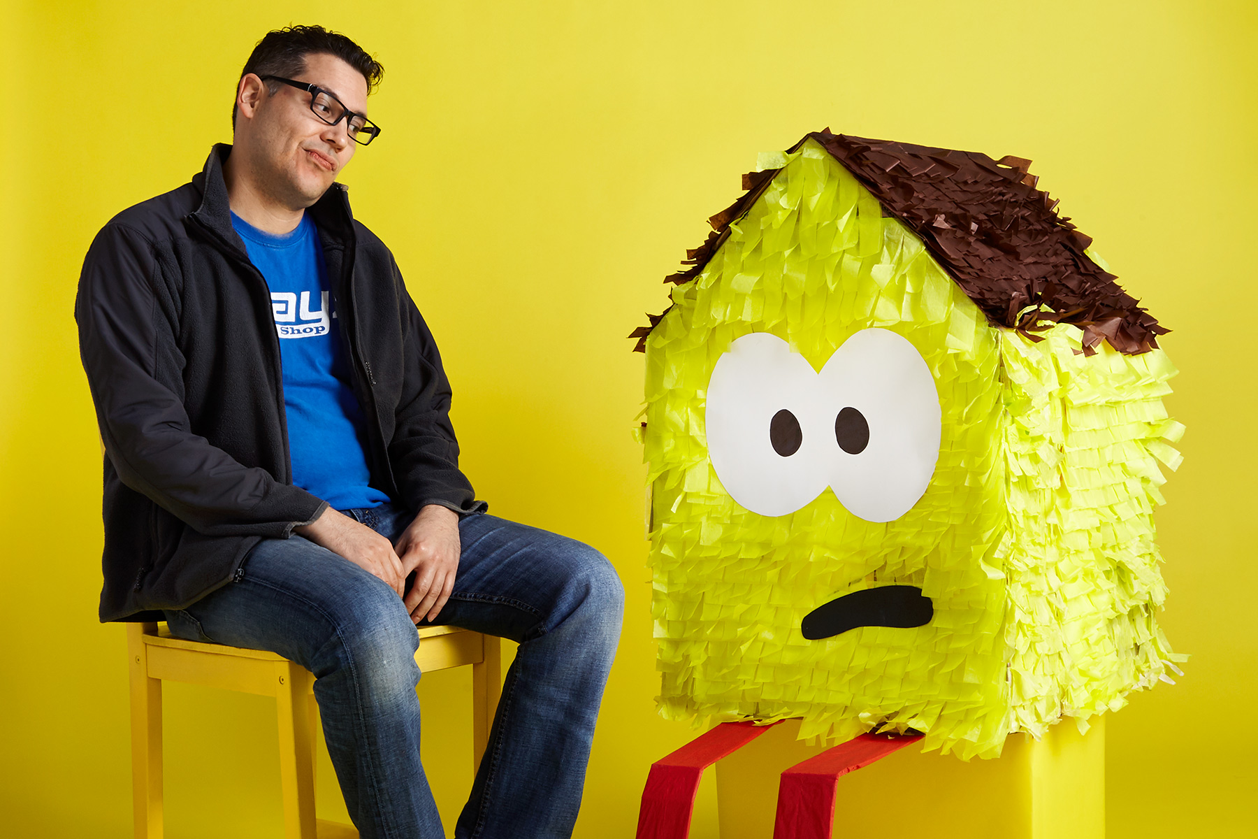
The best-looking campaign in Dallas belongs to Giovanni Valderas, who lost his bid to succeed Griggs in North Oak Cliff’s District 1 to Chad West. Valderas’ campaign put on a master class in visual political communication. His turquoise and pink signs, with an image of his sad-eyed Casita piñatas, are eye-catching. They feel both playful and subversive. There was no greater symbolism in the races this year than his piñata houses, which the artist placed near new construction. It addressed issues of displacement that affect many working class Latino voters in District 1. The custom fonts designed by artist Ryan Rushing were meant to evoke the hand-painted signage on Jefferson Blvd. and did not significantly change appearance whether used in English or Spanish.
The use of the phrase “chancla squad,” which is what supporters of Valderas called themselves, references the sandal that a Latina mom might throw at you if you are behaving badly. It is the perfect name for a progressive, reform-driven campaign like his was. Valderas’ literature also included more bright colors—yellows, oranges, greens—that seem more inviting than the typical campaign. His campaign seemed fun, which is crucial to his mission of attracting millennial and first time voters in his district.
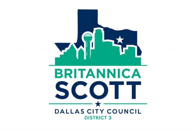
Further south in District 3, Brittanica Scott who lost her bid to incumbent Casey Thomas. But she had an interesting sign that used maverick green and navy blue. The skyline in green was transposed on the outline of the state of Texas in navy, and the white negative space between the two gave it a clean, modern look.
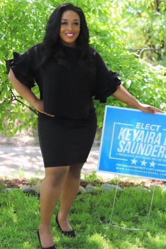
If you like a color, dial it up (or back) a notch for a more distinctive sign. Keyaira D. Saunders, who didn’t make the runoff between incumbent Carolyn King Arnold and Dawn Blair in District 4, had what at first appears to be a basic light blue sign. However, the shade of blue she chooses is distinctive. There was also a subtle, diagonally striped pattern that gave the sign some depth and shimmer. Her name was enclosed in a white box. A simple grouping of three stars at the bottom completed the clean and fresh look.
In West Dallas’ District 6, Monica Alonzo lost to incumbent Omar Navarez. But she featured an attention-grabbing sign in royal purple with her name and a picture of the skyline. Besides the color choice, what made her sign unique was the inclusion of the Margaret Hunt Hill Bridge into the depiction of the skyline, a nod to the West Dallas district she seeks to represent. And a complicated symbol for the progress of the neighborhood: the bridge ushered in new multi-family apartment complexes and led to an increase in rent and property taxes that threatened many longtime residents.
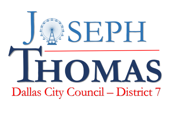
I liked how Joseph Thomas, who challenged incumbent Kevin Felder in District 7, used the Ferris wheel from the State Fair as the O in his name. I would have liked to have seen a non-white background for maximum effect.
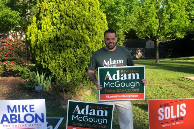
In District 10, the winning incumbent Adam McGough, had a nice re-election sign sporting a forest green background with orange and white lettering. The curvy star in the A was a nice touch, so too was the hashtag on an orange background of #loveyourneighbor.
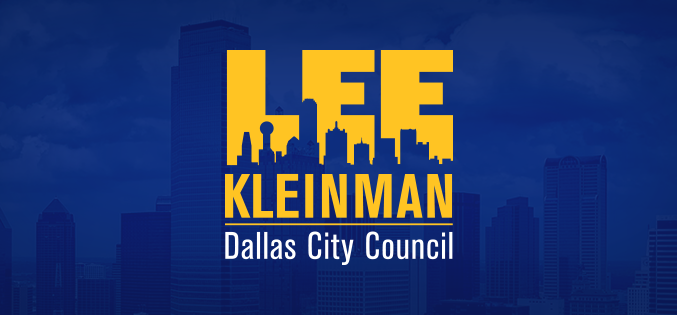
In District 11, incumbent Lee Kleinman had a surprisingly beautiful sign. The fat, oversized, block letters of his first name were in an almost mustard yellow that melted into the skyline of Dallas. His last name was underlined underneath on a royal blue background. I cannot rave enough about how distinctive the letterpress used on the word Lee is, and the sign is equally impressive digitally.
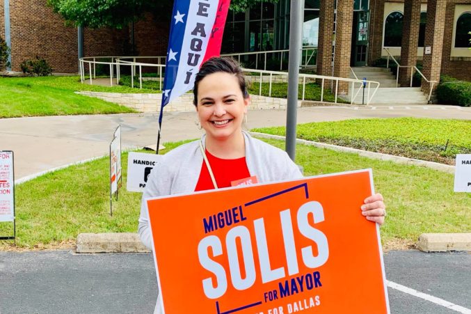
Last but certainly not least, fifth-place mayoral candidate Miguel Solis featured a campaign sign with a bright orange background. The blue and white lettering slanted skyward was the most distinctive of the mayoral candidates. While the other candidates used traditional campaign aesthetics, Solis took a risk and hit it out of the box. References to his Latin American roots, youthful energy, and his slogan “Together for Dallas” managed to communicate a great deal in a while retaining an overall minimalistic format.