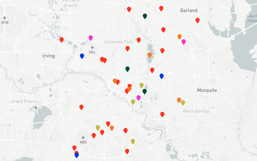
Since the number of murders last month hit a level Dallas hadn’t seen since the 1990s, there have been some calls on social media for a map of where the killings happened. Robert Mundinger—a name you might recognize—has now answered the call.
Over at Robert’s site, TheMap, he’s put together a visualization of Dallas’ 2019 murders, color-coded and sortable by month. Click into one, you’ll find media coverage of the incident. Robert has also added a “DPD Reported Homicides” option, which adds marks on the map where police data indicates a homicide. You’ll notice there is not always direct overlap between the media reports and DPD’s data—all methods have their drawbacks—but taking both together provides a fairly comprehensive picture. (Robert is also inviting people to add to it; he addresses how in this tutorial.)