When I sat down with Dallas ISD Trustee Miguel Solis last week to ostensibly talk about school buses, much more of the time was spent on the district’s broader goal to racially integrate. He called it “one of Dallas’ biggest challenges.” No surprises there: Long one of the most segregated urban districts in the country, DISD has been attempting to reckon with its history and produce a more successfully segregated future. Of course, that’s true for the city of Dallas, too, and these are not unrelated efforts.
As a whole, DISD, as others in this space have laid out, has made strides in the right direction. The district has seen the payoff of progressive programs like Accelerating Campus Excellence, or ACE, which evaluated the district’s best teachers and then incentivized them toward schools of need. Where the district had 43 IR—”improvement required”—campuses in 2013-14, it has just four on which the state bestows that unwanted distinction today.
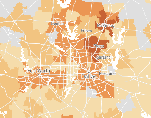
But by way of adding a point to the discussion, I’d like to present a couple of maps, put out today in a new report by ProPublica, that illustrate the importance of the issue of school segregation.
ProPublica visualized state education data on school districts across the country. Caveat needed: They got the most recent numbers available, which only means that this stuff is still at least a couple years behind real-time (a lot of the data is pulled from 2015-16 school year, as discussed here). Zoom in, zoom out, explore by district or by individual school—there’s lots of interesting stuff to take in (although, beware that all that grey space just means the data was unavailable or inconclusive in those areas, particularly misleading when you take a wide-angle view of the country).
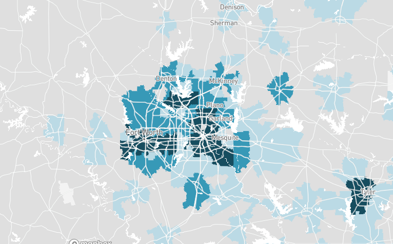
The maps I’ve singled out and screenshotted below show us the close entanglement between segregation and achievement. The first map below represents segregation between black students and white students at the district level, rated on a simple high (darker shades) to low (lighter) scale. The bottom map shows the achievement gap; the darkest shades visible represent black students that are on average 2-3 grades behind their white counterparts while the lightest shades show 0-1 grades behind.
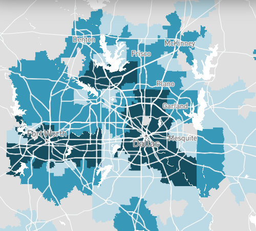
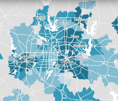
The two sides are not identical, but the patterns are similar. We see similarities in the map of hispanic students, as well. Again, the segregation map is on top while the achievement map is below.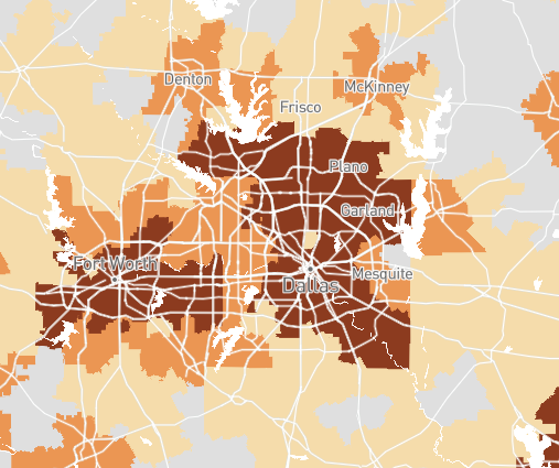
Head here to explore for yourself.