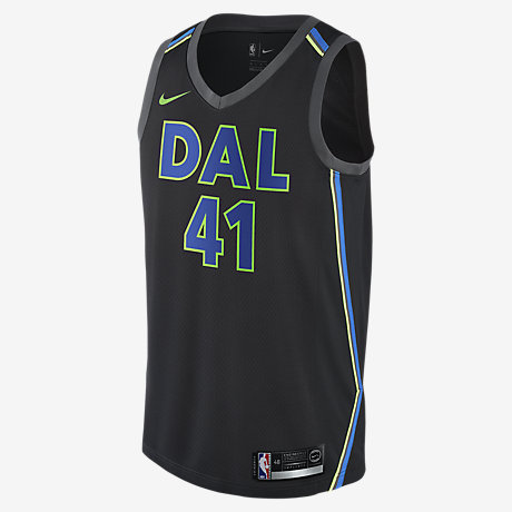
 By now, you have more than likely seen the Dallas Lone Ranger Heroes’ new “City” edition jerseys. If you haven’t, then you can see them in this post, because I included a photo. The jersey you see is the one I am talking about, the result of the NBA’s new uniform supplier deal with Nike, an Oregon-based sportswear concern of some renown. When I first saw a leaked image of the jersey we are currently discussing, I didn’t like it. Then it kind of grew on me. Then it stopped growing. Then, I guess, as I sometimes do, I became indifferent. They are fine. Here is a look at how they came to be and the man — the Lone Ranger Heroes’ longtime equipment manager Al Whitley, aka “Big Al Pumpy” — behind them. If you don’t like them, they will be gone next season, replaced with something else.
Again, I think they are fine. Some people have a problem with the DAL, but three-letter, airport-code-style city nomenclature is sort of league standard (OKC, PHX, etc.) and there aren’t a lot of options there. I mean, I guess they could have just used MAVS or whatever, but I get why they’d go with something else. And there aren’t a ton of other options. DFW? No, sir. NTX? Come on. DTX, maybe. Personally, I would have picked the triple D, which is more iconic and would already have them in a video by The Outfit, TX. But DAL is OK. Sure.
The bigger issue, to me, if I’m going to go down this road, is the jersey taking its visual cues from the Bank of America building and its neon silhouette.
The Dallas skyline is already used on one of the team’s other jerseys. I’ve never been crazy about those, but the Nike version is at least better. But, so, OK, they’ve already done that. To have a blank slate, a chance to sort of re-imagine your identity (look what Utah did!), and then to fall back on familiar tropes is a waste. No shots at Big Al or anyone, it just seems like, even if they went this way, these could have been better, especially since most of the other City jerseys have all these great details, little personal touches that tell a short story. Or they are simply more stylish, at any rate.
While talking this out with my son — my main sounding board/person who has to hear me talk because he’s stuck in a car or at dinner with me — we hit upon what we think would have been a better idea: the Pegasus. Listen, I know. You probably think the Pegasus is already overused. Maybe it is. But I still think a Mavs jersey that strongly incorporated that particular city icon would be — and forgive me for using some design industry jargon here — insanely dope.
The guys on the team want a black jersey? Perfect. It just makes everything else pop. What I’m thinking, and I don’t have the illustration skills to pull this off, so maybe someone can do it for me, is: black jersey. On the front: gleaming red neon Pegasus in the center of a circle, player number inside the outline of the flying horse. On the back: the triple D above a bigger player number, player name below.
Can you see it? I hope so, because I just tried to draw it and it was trash, so I don’t have a visual. Do you hate it? [has already left post long behind without looking back]