 Is Uptown a fun, walkable neighborhood for frivolity and frolicking? Or is it a business-centric hub for getting deals done? That’s the split personality that the Uptown signage seems to indicate. A closer look:
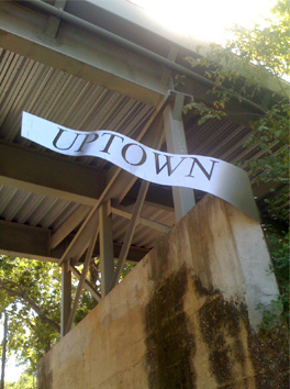
On the one hand, there’s the Uptown Banner. The one pictured here is beneath the Katy Trail on Hall Street, between Turtle Creek Boulevard and Carlisle Street. Look at it: It’s like something you’d see advertising spray-can paintings at a cross between the Renaissance Faire and Burning Man. (I thought I remembered another instance of the banner on Bowen Street, but there isn’t one there.)
 Now look at the Uptown Spikes, one of them at Pearl and McKinnon (left), the other at Pearl and Woodall Rodgers (right). They share the metal, stencil motif of the banner and have the same font, so you know they’re part of the same campaign. But the spikes’ size, shape, and standalone-ness represent severity and strength, where the banners are frilly and festive (“ooh, it’s like it’s rippling in the wind”). The spikes are like spears thrust into the ground (a la a Florida State Seminoles football pre-game, without the face paint), marking territory and meaning business.
In short, the two types of signage convey two emotions. Uptown Banner: “Whee!” Uptown Spike: “Grrr!”
I wish the Uptown Signage People picked one and stuck with it. I’m partial to the spikes. They look kinda cool at night when they’re lit up. Still pretty ’80s, but cool.