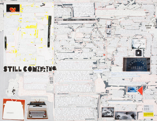
In some of his earlier works, Matthew Sontheimer employed writing that obscured written characters. In these new pieces in the project room at Talley Dunn, a show titled In Conversation, the letters are clear enough, rendered primarily in plain typeface, adhered to the works’ surface like snippets from a babbling ransom note. If there is obfuscation, it comes from the sheer quantity of language and the meandering mapping of a conversation or series of dialogues taking place on the surface of Sontheimer’s work.
Shooting Games (left) 2012, is a vertical piece with columns of typed text surrounding a marked-off rectangular center filled with hand-printed words. There are a handful of images: a gymnast changing her bandages, an aircraft flying past sky-written Olympic rings, another sky-blue image with the tops of the nations’ flags running across the bottom and a photo with a bass player in the top right corner. The word that immediately jumps out at the viewer is “when,” which is not type pasted on the surface, but rather a cut out photograph of the typed word, accompanied by inked outlines and arrows, furthering the complexity of the text/drawing/image remove.

At the opening, amidst a crowd of jabbering wine sippers, it was difficult to follow the seeming logic of the texts, dialogues or monologues, with each speaker’s lines marked by triangulated symbols. Instead, I found my eyes drawn to writing near the images: “No doubt. –watching her physical prowess in the various gymnastic events she. . .” or “two sentences and not just a single re-write of the sentence you were not pleased with?” and so on and so on. The typesetting breaks off; your eye wanders; arrows direct us round and round, only to lose us in the jumble of text; words have speech bubbles; some text is redacted; parts are impossibly small or shouting large. Other snippets of writing take up a variety of topics that seem to orbit on a loose theme: the 1964 Summer Games in Tokyo, injured American gymnast Shawn Johnson, talk of sporting films and footage, self-reflexive questions about the tenses and grammar of the dialogue we are reading.
In other pieces our eyes are drawn to familiar album covers matched with planes of blue color obscuring more text, or a large close up shot of a pen. There is a seemingly benign conversation about biting nails entitled Working Model, 2012. And Three Season Porch includes, amidst its collage of text and images, a reproduction of one of the other pieces in the show. Self-reflective moments recur in a number of the pieces. An enlarged section in Points of Order, 2012 (in 10 pt type face, we are told), reads: “Let’s just cut to the chase with the question that has been nagging us both, do you think what we are doing is drawing or writing?” It is a question voiced by one of the piece’s personae that appears, on the surface at least, to be the artist’s as well.

Reading Sonthemer’s work can feel like walking in on a private conversation, or finding some scattered pages that have fallen out of a notebook or diary. There is something mysterious and inviting about it, but also something mundane and forgettable. If Sontheimer expects us to parse through all of this writing, then the work feels like a admonition, a critique of the glass-tinkling art crowds who don’t pay enough attention to reading art deeply and thoroughly. There may be some of that here, but I suspect Sontheimer, as he has in earlier works, is trying to cofound our efforts to make sense of his art’s language, frustrating the connection between text and reader, orchestrating, as the warden in Cool Hand Luke would say, “a failure to communicate.”
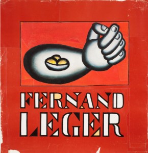
One of only two works in the show that isn’t crammed with text is a 21 x 20 inch red poster-like paper piece emblazoned with the name “Fernand Leger,” accompanied by a reproduction of a Leger, a arm with still life (a simply rendered bowl of fruit) floating in the flexor. The title of the piece is I Thought His Name Was Ferdinand, 2012, a visual pun on the spelling of the artist’s name that also presents another linguistic play, a tongue-in-cheek misunderstanding, a deliberate confusion of text. The inclusion of the work calls to mind Leger’s own assertion that “the object in modern painting must become the main character and overthrow the subject.” Here Sontheimer is playing off the stripped-down cubist and pop art progenitor, using the title of his work to redirect our attention not on the “object,” Leger’s arm, but on the conceptual play between text and title. We can take this game back to Sontheimer’s other works, where the text literally forces out visual “objects,” asserting itself as both surface and subject, language becoming image.
Image at top: Shooting Games (left), 2012 (detail). Mixed media on paper, diptych. 22 x 14 inches (All photos courtesy of Talley Dunn Gallery.


