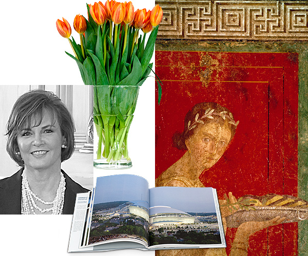
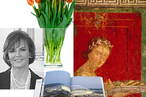
Sherry Hayslip
Biggest design influence: Historical novels read as a young woman; the early modern masters; the Bauhaus; Jacques Garcia; and Edith Wharton
The new neutral: Warm grays and platinums
Every home should have: After the basics like fire alarms and toilet plungers, I think every home should have fresh flowers.
If you were a designer in another country, it would be: Italy or the south of France
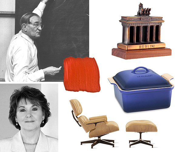
To red or not to red: Pompeii red is the ultimate interior color—especially for walls in a room lit with candles and meant for lively conversations. The walls at the Villa of the Mysteries in Pompeii are the ultimate.
Most overused word in the design world: I say “fabulous” too much. But, in general, the word “repurposed” slightly annoys me for some reason.
Favorite coffee table book: Cowboys Stadium: Architecture, Art, Entertainment in the Twenty-First Century by David Dillon, David Pagel, and Michael Auping
Jan Showers
Biggest design influence: Billy Baldwin and Frances Elkins if I had to pick two. I’m also inspired by travel, art, and the colors of nature. Antique and vintage furntiure have always been strong inspirations as well.
Your color of 2011: A combination of grayed green blue with pale peridot.
The new neutral: Blue
Every home should have: Books, art, mirrors, great lamps. How can I pick? Guess I would have to say books because I can’t live without them.
Favorite home store: I love a great antique store in any city in the world. Yves Gastou in Paris is one I never miss when I’m there.
To red or not to red: I love red, particularly the red the French call “rouge.” But don’t ever use it in the bedroom!
Favorite coffee table book: Bruce Weber’s A House Is Not a Home. It’s out of print, but I’m sure it’s available on Amazon.
Biggest design influence: Japan and nature
Design element you’re so over: Cold, impersonal design
The new netural: I don’t know about it being “new,” but I have long used warm greens as a neutral color, creating a richer natural palette and giving red accents a greater chance to pop visually.
Every home should have: Comfortable seating
If you were a designer in another country, it would be: New Zealand
Favorite home store: Bingoya in Tokyo
To red or not to red: It’s a reliable, classic accent. I prefer it dark and leaning slightly to orange.
Amy Gibbs
Biggest design influence: I am influenced by fashion the most. The fresh, tailored, and sophisticated view of Ralph Lauren is very inspiring.
Your color of 2011: Raspberry
Design element you’re so over: Overly distressed wood furniture
Every home should have: A beautifully potted orchid
Favorite home store: In the spirit of hunting: 1st Dibs and eBay
Cool spots: Vinya and Antiques Moderne
To red or not to red: I think red is too harsh most of the time.
Most overused word in the design world: Busy
Favorite coffee table book: I love my Elvis and Barbie coffee table books.
Biggest design influence: My wife, Chipper, has the best taste and the best eye of anyone.
Your color of 2011: Pink is making some noise.
Design element you’re so over: It doesn’t make any difference because everything comes back again. There are, however, some really bad bedspreads that still haunt me.
The new neutral: Gray is coming back. It always looks great with pink.
Every home should have: A good wine opener
If you were a designer in another country, it would be: Hong Kong would be great—incredible resources available, and they speak English!
Favorite home store: The Conran Shop in London
To red or not to red: It’s my favorite neutral.
Most overused word in the design world: Right now, in this economy, it’s two words: “too expensive.”
Favorite coffee table book: Interior Splendor by Pierre-Yves Rochon
Cheryl Van Duyne
Biggest design influence: Colorist Josef Albers, architect Larry Zerby AIA, and visualizing room changes in my mind for as long as I can remember
Design element you’re so over: Stark rooms without comfortable seating. Very tired of multiple print fabrics that blend and match and overdecorated houses.
Every home should have: Comfortable seating
If you were a designer in another country, it would be: Germany. Bet you thought I would say France!
Favorite home store? Williams-Sonoma. I love kitchen gadgets.
To red or not to red: It’s an exciting and explosive color!
Most overused word in the design world: When people say, “The bones of the house are good.” So tired of that expression.
Favorite coffee table book: Any book with beautiful photography of nature