I’ve thought as much for awhile, and I’m glad to have my suspicions confirmed by ESPN’s just-completed uniform power rankings, on which most of our local professional sports clubs did not fare well.
 The Cowboys are the exception. Their classic, iconic home uniforms are clearly the best-looking kit around these parts, and it earns them 30th among all the teams in the NFL, NHL, NBA, and MLB. (And they’re sixth-best considering just the NFL.) ESPN does think there’s room for improvement:
The Cowboys also lose points for having too many inconsistent shades of blue and silver scattered throughout their uni package.
But aside from when they’re rooting for America’s team, Dallas-Fort Worth sports fans are having to wear some dull jerseys to show their support.
 My main problem with the Rangers is their insistence on switching between red and blue as the primary color instead of just committing to one. Â They’re best in their primary home unis with the blue hat. Forget the red. Other than that, their look is just fine. Not great, but not bad. Â (And at least they’re not dealing with this kind of silliness anymore.) Â ESPN sees a lot of room for improvement, ranking them 20th of the 30 MLB teams, and 66th out of all pro franchises:
The Rangers need a new typeface, or at least a new type treatment. There are too many layers (blue outlined in white, outlined in red, with a black shadow), and the letters and numbers have too many spikes and bumps.
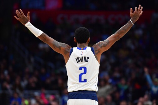
 The Mavericks, on the other hand: I’ve always thought that horse-head logo had been obnoxiously test-marketed to extreme-sports fanatics and drinkers of Mountain Dew. ESPN really doesn’t like the look of the unis, ranking the Mavs 24th among the NBA clubs and 105th overall:
Dear Mark Cuban: We all know you’re very eager to put advertisements on your team’s uniforms. So while you’re at it, how about making a few other changes? For example, navy lettering on a royal background doesn’t look so good, and there’s no good reason for your front uni numbers to be off-center. Someone probably told you that the weird panel on the back of the shorts looked cool, but that someone was lying. And now that you’ve worn the P-Diddy alternate design in three colors, don’t you think maybe it’s time to retire it already? Sincerely, Uni Watch.
 I’m a little surprised to find the Dallas Stars even further down the list. ESPN has them 29th out of the 30 NHL teams, and 117th overall. Â I don’t think the Stars’ look is anything to get excited about, but I also don’t find it offensive to my eyeballs. (And, come to think of it, how could anything rank lower than the mess that is the Miami Marlins?) Â The problem, apparently, is they’re just boring:
You know how people like to say, “Less is more?” It’s often true — but not always. Sometimes less is less. Granted, there’s something perversely amusing about a flashy city such as Dallas being saddled with such a snoozer of a design, but come on. Did the team’s graphics department go on strike or what?
Maybe they should call the folks behind the buzz-generating Downtown Arlington design?
